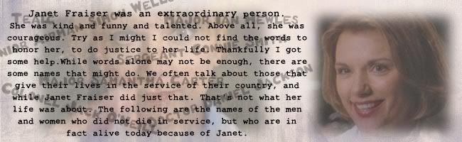
Originally posted by SeNedra
View Post
 Nice! I really like how simple it is, very effective.
 Nice! I really like how simple it is, very effective.

 because each new thing you told me, I thought 'oooh! I know what would look good with that'. So the end result is this
 and I think my MOP penguin is better with the font Josiane told me!
 And I love your new sig! Its very soft and romantic. *shippy sigh*
 And thanks, the more I look at that sig, the more I like it. I used a bigger border because I needed to cover up a couple of mistakes But it was an interesting exercise, and I took notes, so hopefully I'll be able to produce even better things with all the extra stuff you've taught me and panicked in case they didn't like them! So I made them both a few different options, and was delighted when they both chose to use them *happy dance* Its a bit strange to see sigs I've made on posts that are not mine popping up on the threads, Lol! But I'm soooo enjoying Gimping now
 I'm glad you like it Pink is just my favorite color!
 AND it's fluffy!
) But I made myself a blue wallpaper so I felt better.
AND it's fluffy!
) But I made myself a blue wallpaper so I felt better.

Comment