Announcement

Collapse
No announcement yet.

Artwork for All - challenges, graphics, tutorials

Collapse
X
 
  • Filter
  • Time
  • Show
Clear All
new posts

    Lovely arties everyone.
    sigpic

    Comment


      Okay, as requested by JW and yami and scifan, here's a tut to make this sig in PS CS2:


      Spoiler:
      You will need:

      NOTE: These are not in order of use. Normally, I try to get them in here like that, but I didn't this time.

      Open your canvas and fill with White.

      Add first stock, the clock. I didn't resize this at all for the sig, just put it in where the clock was centered.

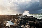
      Add second stock, the wave. Set to Normal, opacity 100%, and flip horizontally. (Edit-->Transform-->Flip Horizontal) Now, position the wave so that it's crashing up over the rock and pointing toward the number 3 on the clock. Using your eraser or mask (whatever your preference), blend so that the edge of the clock stock doesn't show. Don't cut off the rocks along the bottom of the sig!

      Open the third stock, the vintage window. I didn't use the window itself, just the “shutter.” Set to Overlay, opacity 100%, and place just to the left of the clock. Blend the edges.

      Open the fourth stock, the flowers through the window. Set to Soft Light, opacity 100%. Now, I used just a tiny bit of this one. Set it in the upper right corner, and erase whatever you don't want.

      Open your first character image, Susan in my sig. Scale down to the size you want it, flip it horizontally if you desire, and set to Soft Light, opacity 100%. Blend the edges. Duplicate this layer and blend however you need.

      Now, go back to your clock stock and duplicate it. Then, go to Filter-->Blur-->Gaussian Blur. Set the numbers high enough that it obliterates all details of the clock. This should give you a pretty clear version of your character. Erase everything except what is beneath your character. This way, you have the clock “frame” around your character but not the details of the clock showing through.

      Now, back to the top, above Susan.

      Open your fifth stock, the pink and gray flowers. Set to Soft Light, opacity 100%. I positioned this pretty centered, right where Susan's hand holding the bow would be. Duplicate this stock, and set the new layer to Normal, opacity 58%. Erase everything except around the flower at Susan's hand. This brings a lot more detail to the flower.

      Open your second character image, Caspian on his horse in mine. Set to Normal, opacity 100%, and scale down. Blend him in as much as you wish. I also flipped him horizontally, as well, so that he was facing the opposite direction from Susan.

      (That is one thing to insert here. I like to keep my different models facing opposite directions unless I'm going for the "staring in one another's eyes" look. That way, it keeps the piece of artwork balanced and doesn't draw the eye to one particular side of the artwork. Again, if that's your intent, feel free )

      Open your sixth stock, the white flowers. Set to Screen, opacity 100%. I erased most of mine, leaving hints of it only around the top of the wave and the frame of the clock.

      Open your seventh image, the light texture. Set to Soft Light, opacity 100%, and position however you wish. I also went into Blur-->Gaussian Blur and used just enough to get rid of the little squares.

      Now, make a stamp (Ctrl—Alt—Shift—E) and use whatever filters you wish. I used Paint Daubs (Filters-->Artistic-->Paint Daubs) to sharpen it. Then, I erased everything except the two characters because I liked the kind of blurred, ethereal background.

      TEXT
      Spoiler:
      For “No need to say Goodbye,” I used Dark Roast, color #100b0a. Then, I duplicated it and changed the color to #e4e1df. You might use different colors depending on how your background turns out. I did two different layers, one for “No need to say” and another for “Goodbye” so I could get the sizes I wanted for the text. Rotate them however you'd like.

      For the layer of “No need to say,” I also used Layer Style-->Outer Glow. You can set your own settings here, however you'd wish. I used color #e4e1df.

      Now, after this, I did a new layer and filled with color #e4e1df. Set to Screen, opacity 75%, and using a soft brush, erase everything save what's behind your big “Goodbye.” I liked this better than an outer glow here because it was less regular. And I could erase what covered up my background.

      For all other text, I used Times New Roman, size 9pt, in color #100b0a, arranged around the sig as I wanted. I added a similar outer glow to these.


      COLORING
      Spoiler:

      Selective Coloring
      Reds: -100, 0, 32, 0
      Yellows: 1, 0, 39, 0
      Neutrals: -7, 4, 13, 1
      Blacks: 48, 9, 2, -3

      Photo Filter
      Warming Filter (81)
      Density 25%

      Color Fill
      #e6e6e6
      Screen, opacity 100%
      Use layer mask to “erase” middle to give misty appearance.


      After this, make one more stamp and add a 1px stroke (Edit-->Stroke) in the same dark color as your text.

      And you're done!


      I hope this was understandable. Feel free to ask any questions you might have.

      Comment


        Ikorni, Nola, yami and scifan, those are all gorgeous! Really really love that House sig, Ikorni, so beautifully delicate!

        Originally posted by FlyBoyFanGirl View Post
        *smacks josiane with a wet noodle* That's bee-you-tee-full!!!!!!!!!


        Originally posted by yamiinsane View Post
        Josi: That is so gorgeous! My I ask where you found the picture?
        Putting the link in spoiler tags because serious spoilers


        Originally posted by Ikorni View Post
        This is so beautiful and you've got a S6 picture! Now you're making me itch for spoilers!
        Temptation above. But look at your own risk

        Don't forget to PM me your challenge entries! You have until 5pm UK time tomorrow (21 and a half hours from now).
        sigpic
        Artwork for All | Sig & avi by JadedWraith

        Comment


          Thank you for the tut lg

          Here is one of the tutorials that Ikorni requested.

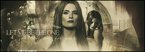
          Here is how I made my Stana sig.


          Spoiler:

          BASE
          1) Open a document to whatever signature size you prefer, I chose 500x180. Fill with white.

          2) Open and paste into the document this clock stock. Try to put the clock just off center and to the right, do not worry about leaving the edge visible. It will be covered up in the following steps. Normal, 100%.

          3) Open and paste this stock into the document. Set to the left of the clock and, with a layer mask, blend into the clock. Normal, 100%.

          4) Open and paste this bridge stock into the document. Set to the right and bottom of the clock and, with a layer mask, blend into the clock and erase the other edge if it's visible. Normal, 100%.

          5) Take this window and paste it into the document. Set to Multiply, 100%.

          6) Add this fire stock and set it to Normal, 100%. Erase the edges and set to the bottom center of the canvas. Make sure you erase this with a layer mask so you can go back and add more of this stock or less.

          7) Add your first picture of your character. Resize to as small as you like and place off center. Cut your character completely out of the background.

          8) Add another picture of your character. Resize if need be and place just to the left of the smaller picture. Cut her/him completely out of the background.

          9) Make a copy of the second stock and bring to the front. Move to where the fog is just under where your main character picture is and erase whatever you don't like.

          10) Take this texture and add it to the left side of the canvas. Set this to Lighten, 100%. Duplicate the layer and set this one to Screen, 100%. Erase whatever you don't like but make sure the words are still visible.

          11) Take this texture and add it to the canvas. Resize to about the size of your canvas and set to Soft Light, 100%. If you need to, use the smudge brush to clean up the texture on top of your characters pictures. Create a stamp of your current work, you will need this later.

          COLORING
          12) Curves: Increase Contrast (RGB)

          13) Hue/Saturation: Colorize checked. Hue: 202, Saturation: 9, Lightness: +13.

          14) Photo filter: Default with Warming Filter (LBA)

          15) Selective Color:
          -Whites: 83, 29, 0, -49
          -Neutrals: 9, -6, -12, 16
          -Blacks: 13, -4, 9, -11

          16) Color Fill #1: #051f25. Set to Exclusion, 100%.

          17) Color FIll #2: #290d2b. Set to Exclusion, 76%.

          18) Take the stamp you created in step 11 and bring to the front. Set to Normal, 25%.

          19) Curves: Point 1: Output: 140, Input: 158.

          20) Gradient Map: Washed away art Gradients #2: Gradient #12. If you can't use Photoshop gradients: #ebecc2 to #402b0e. Set to Overlay, 50%.

          21) Duplicate the stamp from steps 11 and 18. Bring to front, set to Overlay, 14%

          FINISHING TOUCHES
          22) Create a stamp. Use Topaz Clean, Crispstyle. Set layer to Normal, 60%. NOTE: If you do not have Topaz Clean, don't worry. Just use whatever filters you use to finalize your art.

          23) Create another stamp. Use Paint Daubs: 1, 1. Set layer to Normal, 40%.

          24) Create one last stamp. Blending Options: Stroke: Default, size: 2.

          25) Watermark your work, if you do, and you are finished.


          If you have any questions let me know. And, I don't think I've stated this but, this tut can also be found @mylj and @myblog. Those will be put up later tho.
          sigpic
          Icon and Sig by me.

          Comment


            *shares new drawing*

            *comes back lurking*


            sigpic
            My vids Sig made by me

            Comment


              I love the drawing of Teryl!!! Beautiful Chemmy
              sigpic

              Comment


                Thanks for the tuts Ladygris and Yami.

                Originally posted by JadedWraith View Post
                Gorgeous Tardis banner scifan. Really like the text you chose to add to it...
                Thanks hun. I was trying to think of one from River so I just chose that one.

                Originally posted by XFchemist View Post
                *shares new drawing*

                *comes back lurking*


                http://imageshack.us/a/img856/7969/48jy.th.jpg
                Beautifully done. Great job XF!

                Comment


                  Originally posted by josiane View Post
                  Ikorni, Nola, yami and scifan, those are all gorgeous! Really really love that House sig, Ikorni, so beautifully delicate!

                  Putting the link in spoiler tags because serious spoilers [/spoiler]
                  Thank you and thanks for the spoilers! They really made my day.

                  Originally posted by yamiinsane View Post
                  Thank you for the tut lg

                  Here is one of the tutorials that Ikorni requested.
                  I can't wait to try this...thank you for sharing it!

                  Originally posted by XFchemist View Post
                  *shares new drawing*

                  *comes back lurking*

                  I'm outta green, XFchemist.

                  Originally posted by scifan View Post
                  Thanks so much Ikorni.

                  These are beautiful. Love the coloring.
                  Thank you.
                  Fics | Art | Tumblr

                  Comment


                    Originally posted by JadedWraith View Post
                    Gorgeous Tardis banner scifan. Really like the text you chose to add to it...
                    Originally posted by Ikorni View Post
                    It's Georgie Henley aka Lucy Pevensie from the Narnia films. I just liked her the best.

                    And this *was* supposed to be a challenge entry, until it didn't work out.

                    http://i1241.photobucket.com/albums/...ps6b030f4f.jpg
                    How did I miss this? I never shipped them, but looks awesome.

                    Someone pointed out to me that House was the equivalent of Holmes, but in the medical field and Wilson was his Watson. Cool concept and twist. IMO.

                    Comment


                      Originally posted by JadedWraith View Post
                      Gorgeous Tardis banner scifan. Really like the text you chose to add to it...
                      Originally posted by josiane View Post
                      Ikorni, Nola, yami and scifan, those are all gorgeous! Really really love that House sig, Ikorni, so beautifully delicate!


                      Putting the link in spoiler tags because serious spoilers


                      Temptation above. But look at your own risk

                      Don't forget to PM me your challenge entries! You have until 5pm UK time tomorrow (21 and a half hours from now).
                      Thanks Josi.


                      I don't say this to often, but SQUEEEE!
                      Spoiler:
                      Not the response I was expecting... glad I was wrong.

                      Comment


                        *pokes head in*
                        So, Val has been kinda busy where 20in20 icon challenges are concerned, and she thought she'd share over here.


                        Each icon leads to a different 20in20 set.
                        sigpic

                        Comment


                          Great job on them all Valerie.


                          Last two... I promise.


                          Comment


                            Originally posted by Valerie_Jackson View Post
                            Wow, Valerie: what great ideas for icons. It takes me ages to get one done, and that's after two or three failed attemps. At least Well done. Really like the window of oppportunity ones: that's my fave episode ever so....
                            sigpic
                            Beautiful signature and avatar by Yamiinsane. You're a mind reader!
                            Aristides de Sousa Mendes

                            Comment


                              When having a black background- Is there any way to reduce the opacity in a pic layer, without turning the whites greyish?
                              sigpic

                              Comment


                                Originally posted by Major Ryan View Post
                                When having a black background- Is there any way to reduce the opacity in a pic layer, without turning the whites greyish?
                                I have GIMP so I don't know if this will help. Sometimes if you change the layer mode that can help or when you use both layer masking and the blending tool. Might have to adjust the color a bit though.

                                Comment

                                Working...
                                X