Announcement

Collapse
No announcement yet.

Artwork for All - challenges, graphics, tutorials

Collapse
X
 
  • Filter
  • Time
  • Show
Clear All
new posts

    So, as promised, tut for this wallpaper:


    Spoiler:

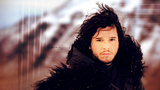
    This is mostly just colouring and enhancing, to be honest

    1. Open a new canvas and fill with #905f50 (a nice dusky brownish pink)

    2. Resize the picture of Jon Snow and place it on the canvas. This was a super hi-res one so I actually reduced it a lot to make it fit. Set it to hard light so the pinky tones from the background show through.

    3. It looks awesome for the background and his clothes/hair, but makes his face look weird, all dark and flushed. So lighten that by adding a new layer between the background and the picture layer, and then using a big soft brush with a nice pale fleshy colour (something like #f7d9ad) just to paint underneath his face.

    4. Add a curves adjustment layer to brighten the whole thing and add contrast. Instead of bending the curve though, set the bright and dark points using the eye-droppers in the curves dialogue - click with the white one on the brightest point just above his head, and the black one in the dark bit under his ear. This sets the tonal range of the light/dark on the picture and increases the contrast beautifully.

    5. Add a selective colour layer, as follows:
    Reds: C-47, M-13, Y-14, B0
    Magentas: M-31
    Blacks: C0, M0, Y-10, B+5
    This brings out blue and pink tones and further increases the contrast (I love contrast )

    6. Next a colour balance layer, doing more of the same kind of thing
    Shadows: C-R -20, M-G 0, Y-B +9
    Midtones: C-R +9, M-G 0, Y-B -3
    Highlights: no change

    7. Now make a stamp of the whole thing and use the gaussian blur with a reasonably high setting (around 10px). Add a layer mask and erase over Jon so that the blurring only applies to the background.

    8. Make another stamp and sharpen.

    9. Next add this texture, set to color burn at 40%, and use image>adjustments>hue/saturation to take most of the colour out of it (move the saturation slider almost but not quite all the way down to the left). Again add a layer mask and erase the part over Jon.


    10. Finally the text. "You know nothing" is in Callie Hand, and "Jon Snow" in Trajan Pro. Both are in black, then set to overlay to blend them in.
    sigpic
    Artwork for All | Sig & avi by JadedWraith

    Comment


      And tut for this wallpaper:


      Spoiler:

      1. Open a new canvas and position the three pictures of Stana on it, blending them together. Get the blending right around Stana each time but don't worry much about the edges otherwise - they'll get well hidden as we go!

      2. Extend the background behind the three pictures by using a larger version of one of them (these are also lovely hi-res images so there's lots of space to work with!) placed on the canvas a couple of times in between the background layer and the three picture layers. Do a little bit more blending on the top three if needed but again don't worry too much. You should end up with something like this:


      3. Desaturate the whole thing by adding a new layer, filling with #362f2d and setting to color. This is a slightly warmer shade of grey than you'd get by just straight desaturating, as I wanted to retain some of the brownish tones.

      4. Add this texture and set to multiply. This gives a little texture to the whole thing and makes it more sepia.


      5. Add a curves adjustment layer to brighten. There are three points on this curve, as follows:
      - Output 30, input 30
      - Output 82, input 63
      - Output 197, input 122
      As usual, play around - what you're aiming for is brightness and contrast

      6. Next, add this texture, resized and rotated so that the folds of the paper frame the three pictures of Stana. Set it to color burn at 50%. It makes the background way too dark though, so first use the magic wand tool to select everything that isn't the central paper image, and then use the fill tool to fill with #905f50 (the same dusky pink I used in the Jon Snow wp ). This just makes the contrast between the bit with Stana and the background a little less harsh.


      7. Next add this texture set to soft light - this lightens and brings more colour back.


      8. Then add this texture, set to darken, and positioning the holes of the notepaper so that it forms a border with the left side of the Stana pictures. You'll need to extend the notepaper texture to the left of the canvas (use the eyedropper tool and fill tool to do so). You'll also need to use a layer mask to erase the bit over Stana.


      9. Now add a selective color adjustment layer, to get rid of some of the yellowness that the last couple of steps introduced. Settings as follows:
      - Reds: C 0, M 0, Y -17, B 0
      - Yellows: C 0, M 0, Y -15, B 0

      10. Now a color balance layer:
      - Shadows: C-R +26, M-G 0, Y-B +24
      - Midtones: C-R -15, M-G 0, Y-B -19
      - Highlights: C-R +5, M-G 0, Y-B -9
      This brings out lots of lovely reddish tones

      11. Another curves layer. Use the black and white eyedroppers to pick the darkest and brightest points and adjust the curves that way.

      12. Finally, make a stamp of everything and sharpen, and then add the text. The font is Jenna Sue and the colour is selected using the eye-dropper tool.


      If anyone needs me to explain anything in more detail for either of those, just say!
      sigpic
      Artwork for All | Sig & avi by JadedWraith

      Comment


        Thanks for the tuts, josi! *bookmarking to try them later*

        So, I waited until today to post because I wasn't sure I was really pleased with this. But, after some sleep, I am.


        I was inspired by a piece I found online for Calliegh and Delko from CSI Miami, but I kind of tweaked it.

        Comment


          You should be pleased with it lg - care to make a tut?

          Lovely wps Josi - thanks for the tuts

          Can I just remind everyone that it helps a lot if you state which program was used for your tuts? Thanks

          Comment


            a texture I'd thought I'd share
            sigpic

            Comment


              and another
              sigpic

              Comment


                Thanks, Jumble.

                Here's the tut you asked for.

                To make this in PS CS2:


                It was inspired by this wallie by someone else. The person's screenname is on it.


                Spoiler:
                You will need:

                Open your canvas to the size you need. Then, place the first texture, the gray scratchy one, in there on Normal. Scale as needed. I didn't worry about keeping aspect here because it was a background color. Then, go to Filters-->Blur-->Gaussian Blur and raise it enough to wipe out the texture but keep the color.

                Open the second texture, the scratched one. Scale up and set to Overlay, opacity 100%.

                Open your character picture. For this one, I duplicated several times to remove the “Entertainment Weekly” logo on the top right corner. Place it where you'd like it. Duplicate, apply the same Gaussian Blur settings as in Step One, and move behind your main picture. This should create a nice shadowing effect.

                Now, open the third texture, the small lights, and flip horizontally. Set to Screen, opacity 100%. Place on the lower left side of the picture.

                Open the fourth texture, the three-in-one thing. Set to Lighten, opacity 65%. This one, I erased everything except the bottom image. Set the center of the “spark” right on the lower left corner of your image.

                Open the fifth image, the squiggly lights. Set the layer to Screen, opacity 100%. Place it over the light effects already there. Now, duplicate this layer twice. Set the first layer to Lighten, opacity 100%, erasing over your character if necessary. Scale the second one down to about half of the original and set it just to the top of the bottom edge of the picture. Leave this layer on Screen, opacity 100% So, you should have three layers of this image.

                Now, this is where it gets a little out of order.

                Open your sixth texture, the polaroid of the clouds. Set to Soft Light, opacity 100%. Scale up or down as needed, place where it adds some glow around the picture, and erase the white edges. Now, duplicate that layer, darkening the glow of the clouds around the edge of the picture. Erase as needed so your character isn't too yellow. (I used this image four times: twice on the left side of the picture and twice on the right. For the right, I flipped it horizontally and moved it down so that the clouds were at the bottom of the picture rather than the top.)

                Now, copy your character pic. Move it on top of all these layers and set to Soft Light, opacity 46%. Duplicate this layer. Go to Image-->Adjustments-->Desaturate. Set this desaturated layer on Soft Light, opacity 37%. This step just adds in all the sharpness that was taken out by the lighting textures.

                Now, once you've gotten everything where you want it, add your text. I used Gabriola, color #a86b53 for everything. Sizes: 150 pt for “hawkeye,” 24 pt for “Do you know what it's like. . . .?” and 20 pt for “Clint Barton.” Set all of your text below the polaroid clouds but above the light effects. (I apologize for not having a link to the font. It came with PS, I think.)

                COLORING
                Selective Coloring
                Reds: +30, +2, -18, +48
                Yellows: +9, +3, -22, +35
                Neutrals: +31, +11, -3, +3
                Blacks: +100, -1, -16, +4

                Little tip on Selective Coloring: I do the Neutrals and Blacks first because those effects are strongest and provide the most contrast. Then, I go back and add in the other colors.

                Now, duplicate the scratch texture from the very beginning of the wallpaper. Bring it all the way to the top, above the Selective Coloring, and set to Screen, opacity 100%. Duplicate that screened layer, erasing the left side so it's not too bright.

                Open the seventh and final texture, the slanted light. Scale as needed to cover the entire canvas. Set to Soft Light, opacity 100%. I erased a bit where the light made Hawkeye's face a bit too bright.


                And you're done! Feel free to ask if you have any questions!

                Comment


                  Thanks lg

                  Comment


                    Lovely textures, Nola. I'm thinking hard where can I used them.

                    lg and Josiane: I'm so going t try your tuts, as soon as I can get a bit more organized.

                    Everyone kindly pat me in the back: I just made safety copies of my docs ( including art). I was bound to a bitter experience if all my stuff would be missing.
                    sigpic
                    Beautiful signature and avatar by Yamiinsane. You're a mind reader!
                    Aristides de Sousa Mendes

                    Comment


                      I decided to try my hand at colourisation and came up with this. It looks a bit clunky (only my second try at this!) but hopefully it'll get better from here!


                      The tutorial is below if anyone's interested.

                      Spoiler:

                      1. Adjust the brightness/contrast to your liking. I made mine brighter with a wee bit more contrast.

                      2. New Layer: Skin
                      Paint over all exposed parts of the skin using #dfc5b1. Set to Color > 70% (this depends on the image that you have)

                      3. Repeat step 2, with #ffb8fe. Set to Color, opacity 10%. Again, this depends on the image. So play around with the shades and the opacity. I probably tried tons of colours before deciding on this one.

                      4. Optional step: Highlights on face/contouring. I used #3d3a38 (soft light, 32%) just to give her face some contours, especially in the cheeks and parts of the forehead.

                      5. New layer: lips
                      Using #630303, paint over the lips. Set to soft light > 40%. I wanted a reddish-brown for the lips but nothing too overt.

                      6. New layer: eyes
                      First, paint #00000 over the lids of the eyes. Normal > 20%

                      7. New layer: eyes. This time, paint over the eye lids with a light grey or any other colour that you like to see. Play around with the opacity, set blending mode to soft light or color.

                      8. New layer: hair
                      Julianne Moore has gorgeous red hair so I chose this shade: #6e270e, Color, 30%.
                      Fics | Art | Tumblr

                      Comment


                        You're welcome, Jumble.

                        JW, I look forward to what you come up with.

                        Ikorni, it looks great! Colorizations aren't necessarily the easiest thing, but they can be so much fun. I have several images I want to colorize.

                        Comment


                          Thanks ladygris! Colourisation has always been a hit and miss thing for me. Sometimes I just can't get the shades right and if only there's a fixed template for it, I'd be damn happy!
                          Fics | Art | Tumblr

                          Comment


                            Originally posted by Ikorni View Post
                            Thanks ladygris! Colourisation has always been a hit and miss thing for me. Sometimes I just can't get the shades right and if only there's a fixed template for it, I'd be damn happy!
                            You're welcome.

                            I use tuts on Shadowplay. You have to be a member to join there, but they have some really good pointers.

                            Comment


                              Originally posted by ladygris View Post
                              You're welcome.

                              I use tuts on Shadowplay. You have to be a member to join there, but they have some really good pointers.
                              Oh, that's actually where I got my colourisation ideas from. But each tutorial is so tailored to the picture that they use, I find that it's near impossible to replicate the steps when I use another image. So it's typically back to the drawing board for me.
                              Fics | Art | Tumblr

                              Comment


                                Great artwork everyone! That is always an interesting challenge to see what people will do.
                                Icon by AceofHadeon Sig by TrueRomantic

                                sigpic

                                Comment

                                Working...
                                X