Announcement

Collapse
No announcement yet.

The secrets on how to make artwork of the Sam/Jack ship family thread

Collapse
X
 
  • Filter
  • Time
  • Show
Clear All
new posts

    Originally posted by josiane View Post
    Lovely, but maybe try lightening it a little? I think the sepia is a great idea, but it's a bit dark at the moment


    *thunks* Gorgeous luvnjack! Your mojo's definitely back there!

    Ooh and I forgot to quote it but Achaja the Vala pic is beautiful!
    what's a bit dark? Sorry I'm out of it today

    My Fanfiction My Sam/Jack vids (yahoo) My LJ
    Thanks everyone for my b-day icons and sigs!
    Nobody can make you feel inferior without your consent. ~Eleanor Roosevelt

    Comment


      Originally posted by Regularamanda View Post
      what's a bit dark? Sorry I'm out of it today
      The whole thing, really. If you lighten it then the pics will be clearer
      sigpic
      Artwork for All | Sig & avi by JadedWraith

      Comment


        Originally posted by josiane View Post
        The whole thing, really. If you lighten it then the pics will be clearer
        Ahhh.... How does one go about lightening it up in gimp?

        My Fanfiction My Sam/Jack vids (yahoo) My LJ
        Thanks everyone for my b-day icons and sigs!
        Nobody can make you feel inferior without your consent. ~Eleanor Roosevelt

        Comment


          Originally posted by Regularamanda View Post
          Ahhh.... How does one go about lightening it up in gimp?
          Make a stamp of the whole thing (Ctrl+Shift+C) and paste onto a new layer. Then set that to screen and adjust the opacity until it looks nice
          sigpic
          Artwork for All | Sig & avi by JadedWraith

          Comment


            Tutorial for S/J wp I made this afternoon…someone requested a tutorial for it! ?

            Spoiler:


            1. First open the texture..I already liked it but I wanted some small changes so I made a new layer and filled it with a dark blue color set to exclusion(100%). I made another layer filled it with fbdbb7(salmon kind of color) multiply 100%. Followed by a gradient map 100% b/w.
            Open you “main picture…put it on the right side and blend it in with the background. As example I put mine on hard light copied it and put the other layer on screen. Both 100%. Btw the blending was done with the lasso tool 15 px. But you can also do it with a layer mask…doesn’t make much difference.

            2. Grab all of your other pictures…I estimated I needed 5 and organized them as I wanted. I blended them all in with 15 px lasso tool while the layer was on hard light. When I was done with the lasso tool I put the layer on screen, duplicated it; put that one on soft light. Do this with all the small pictures till you’ve got them rounded around your big one.
            The screen was always 100% but the soft light varies between the layers.


            3. Now I found it good but it was too simple. I made a new layer, got my rectangular marquee tool and selected with that the picture part of my wp. I copied it and paste it on the new layer. I went to edit? transform ? rotate. And rotated the pic a bit and did it a bit to the left. I made a new layer behind it, selected it with the magic wand tool and did invert(this was because I need the picture I just made selected. Filled the selected part with white and went to edit? transform? scale…I made it a bit bigger moved it a bit so it fit with the newer picture. On it I got a brush(from tape) and used it. It’s a really oldie so I don’t know where I got it from. I rotated it on the left side a bit so it looked right.


            4. The coloring! What I do is probably not all necessary…but I was bored so experimenting a lot.
            Layer? adjustment layer ? selective color
            Red -3, -36, -7, 0
            Yellows: +11, -14, -28, 0
            Greens 100, 100, -100,0
            Cyan: 100, 100, 100
            Blue 100, 100, 0, 0
            Neutral: -17, -12,-11, 17

            Stamped it(shift+ctrl+alt+e)
            Copied it. put the first of these layers on filter? sharpen?unsharp mask. Made it really sharp,.
            Upper layer: filter ? noise? reduce noise. Strength : 10, preserve details : 5% other two on 0. Grabbed my eraser and deleted the eyes etc out of this layer so the sharp layer is visible on the places you want the wp to be sharp.

            Stamped it again. Copied that layer, screen(52%)

            Color balance(layer?adjustment layer? color balance)
            Shadows: +2, -5, +20
            Midtone: -19, -3, +26
            Highlights: +29, +17, +5
            Levels:
            0, 1,12, 225
            Made a new layer, filled it with the earlier mentioned salmon. Multiply 52%

            5. made a new layer, grabbed the color white and a heart brush. Put it in the picture,(1 heart) mirrored it and rotated a new one(2nd heart) a bit so you have two hearts that are connect. Made another new layer, grabbed a splatter brush. Used the eyedropper tool to get some colors from the wp and used the splatter brush twice(on the place where the text has to come.
            Found a nice quote on the internet(copy paste). Lettertype whitelighter for the straight letters. Scriptina for the few words like “hero”. Used for these words other colors and these were 36 pt instead of 30 pt like the rest of the text.

            Stamped again. Made a white edge of 3px around wp. (inside)


            6. Got a gradient map(layers?adjustment layers? gradient map) used a bright blue color and a normal light blue color. (96f4ff and 2d556e) Put the gradient map on soft light: 45%

            Again stamp. I found it quite empty on the left side so I made another new layer…grabbed a brush with tiny text and made that one the left side. On top of that with 60pt??? and font angel I made the words Sam and Jack. I went to transform/rotate to rotate them a bit. (slanted)

            Color Balance.
            Shadows: +17, -10, + 5
            Midtone: -36, 0 , +1
            Highlights: -15, 0, -30

            Gradient map…used a darkish green color and a blue/greenish one(67a7be and 36611b)

            Got another texture, soft light 49%...deleted the part(with lasso tool 15 px) that covered S/J and blendings.

            Stamp again(shift+ctrl+alt+e) filter? sharpen. Edit—>fade sharpen 50 %.

            And volia…you have a wp.
            sigpic

            Comment


              Or, if everything is merged down to one layer, duplicate the layer (cntrl+shift+d) and set it to screen.
              sigpic

              Comment


                Achaja beautiful card Love the text as well!!

                Originally posted by Regularamanda View Post
                Thanks! And I love what you just made!!!

                So I made this...but I really really don't like it...I may try it with color and then go back and add borders...
                http://i697.photobucket.com/albums/vv339/regularamanda/th_snapshot.jpg
                I think it looks good...perhaps a bit less red...but it's good and I love the text

                Originally posted by luvnjack View Post
                *stumbles into thread, falls on face, drops WPs*

                One with text, one without. Though, there is a lot going on in it and I'm not really sure it can be used as a WP on a desktop. Still. I heart it. Muse was very reluctant to come back from vacation. *whew!* Took me all morning.

                EDIT: THUNK WARNING!!!

                http://i200.photobucket.com/albums/aa214/missnjack/Artwork/th_jackangel.jpg

                http://i200.photobucket.com/albums/aa214/missnjack/Artwork/th_jackangel2.jpg

                And now comes the credits:

                Wing brushes

                Background

                Light beam brushes
                Texture
                Texture
                Texture

                All of the above mentions deviants are just brilliant and you should really check them out, no matter your style.
                THUNK!!! Mojo is back LJ
                sigpic

                Comment


                  Originally posted by starlover View Post
                  Tutorial for S/J wp I made this afternoon…someone requested a tutorial for it! ?

                  Spoiler:


                  1. First open the texture..I already liked it but I wanted some small changes so I made a new layer and filled it with a dark blue color set to exclusion(100%). I made another layer filled it with fbdbb7(salmon kind of color) multiply 100%. Followed by a gradient map 100% b/w.
                  Open you “main picture…put it on the right side and blend it in with the background. As example I put mine on hard light copied it and put the other layer on screen. Both 100%. Btw the blending was done with the lasso tool 15 px. But you can also do it with a layer mask…doesn’t make much difference.

                  2. Grab all of your other pictures…I estimated I needed 5 and organized them as I wanted. I blended them all in with 15 px lasso tool while the layer was on hard light. When I was done with the lasso tool I put the layer on screen, duplicated it; put that one on soft light. Do this with all the small pictures till you’ve got them rounded around your big one.
                  The screen was always 100% but the soft light varies between the layers.


                  3. Now I found it good but it was too simple. I made a new layer, got my rectangular marquee tool and selected with that the picture part of my wp. I copied it and paste it on the new layer. I went to edit? transform ? rotate. And rotated the pic a bit and did it a bit to the left. I made a new layer behind it, selected it with the magic wand tool and did invert(this was because I need the picture I just made selected. Filled the selected part with white and went to edit? transform? scale…I made it a bit bigger moved it a bit so it fit with the newer picture. On it I got a brush(from tape) and used it. It’s a really oldie so I don’t know where I got it from. I rotated it on the left side a bit so it looked right.


                  4. The coloring! What I do is probably not all necessary…but I was bored so experimenting a lot.
                  Layer? adjustment layer ? selective color
                  Red -3, -36, -7, 0
                  Yellows: +11, -14, -28, 0
                  Greens 100, 100, -100,0
                  Cyan: 100, 100, 100
                  Blue 100, 100, 0, 0
                  Neutral: -17, -12,-11, 17

                  Stamped it(shift+ctrl+alt+e)
                  Copied it. put the first of these layers on filter? sharpen?unsharp mask. Made it really sharp,.
                  Upper layer: filter ? noise? reduce noise. Strength : 10, preserve details : 5% other two on 0. Grabbed my eraser and deleted the eyes etc out of this layer so the sharp layer is visible on the places you want the wp to be sharp.

                  Stamped it again. Copied that layer, screen(52%)

                  Color balance(layer?adjustment layer? color balance)
                  Shadows: +2, -5, +20
                  Midtone: -19, -3, +26
                  Highlights: +29, +17, +5
                  Levels:
                  0, 1,12, 225
                  Made a new layer, filled it with the earlier mentioned salmon. Multiply 52%

                  5. made a new layer, grabbed the color white and a heart brush. Put it in the picture,(1 heart) mirrored it and rotated a new one(2nd heart) a bit so you have two hearts that are connect. Made another new layer, grabbed a splatter brush. Used the eyedropper tool to get some colors from the wp and used the splatter brush twice(on the place where the text has to come.
                  Found a nice quote on the internet(copy paste). Lettertype whitelighter for the straight letters. Scriptina for the few words like “hero”. Used for these words other colors and these were 36 pt instead of 30 pt like the rest of the text.

                  Stamped again. Made a white edge of 3px around wp. (inside)


                  6. Got a gradient map(layers?adjustment layers? gradient map) used a bright blue color and a normal light blue color. (96f4ff and 2d556e) Put the gradient map on soft light: 45%

                  Again stamp. I found it quite empty on the left side so I made another new layer…grabbed a brush with tiny text and made that one the left side. On top of that with 60pt??? and font angel I made the words Sam and Jack. I went to transform/rotate to rotate them a bit. (slanted)

                  Color Balance.
                  Shadows: +17, -10, + 5
                  Midtone: -36, 0 , +1
                  Highlights: -15, 0, -30

                  Gradient map…used a darkish green color and a blue/greenish one(67a7be and 36611b)

                  Got another texture, soft light 49%...deleted the part(with lasso tool 15 px) that covered S/J and blendings.

                  Stamp again(shift+ctrl+alt+e) filter? sharpen. Edit—>fade sharpen 50 %.

                  And volia…you have a wp.
                  Thanks, I'll read this through after my next class.
                  Icon by AceofHadeon Sig by TrueRomantic

                  sigpic

                  Comment


                    Thanks Jann, and for the tut, I think it's really worth to try it wonder if I could make such a beautiful artwork
                    sigpic
                    sig thanks to Luci

                    Comment


                      Originally posted by Achaja View Post
                      Thanks Jann, and for the tut, I think it's really worth to try it wonder if I could make such a beautiful artwork
                      Thanks

                      I'm thinking of posting it in the artwork thread as well...but I'm afraid that my tut would look like...stupid... compared to the ones of the people in there...they're so good
                      sigpic

                      Comment


                        Originally posted by starlover View Post
                        Thanks

                        I'm thinking of posting it in the artwork thread as well...but I'm afraid that my tut would look like...stupid... compared to the ones of the people in there...they're so good
                        Go Post it!!

                        I just realized that there's no way I'll be able to follow it Maybe...someday

                        And some Jack thunkage-

                        *must stop gimping...must stop gimping*
                        Last edited by Regularamanda; 22 April 2009, 02:55 PM.

                        My Fanfiction My Sam/Jack vids (yahoo) My LJ
                        Thanks everyone for my b-day icons and sigs!
                        Nobody can make you feel inferior without your consent. ~Eleanor Roosevelt

                        Comment


                          Wonderful work Achaja, Amanda and LJ.


                          Originally posted by starlover View Post
                          Thanks

                          I'm thinking of posting it in the artwork thread as well...but I'm afraid that my tut would look like...stupid... compared to the ones of the people in there...they're so good
                          *pokes*

                          Go post it there! There's no good/bad, it's a tut, and people might learn from it.

                          *pokes again*
                          sigpic

                          Comment


                            good evening shippers


                            i bring 5 more headers =) you are welcome to use them on LJ's if you credit

                            Spoiler:

                            Comment


                              Natasha! Great headers! I adore the colouring on the last one, tut? :3 *bats eyelashes*

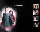
                              Also, I caved and made a Doctor Who wallpaper. I've been going on a bit of a DW binge lately, so it was bound to happen soon.

                              Too cool for a signature.

                              Comment


                                Originally posted by luvnjack View Post
                                The text seems a little too decorative to be curving...the loops from the font are crowding together, which is probably why people are having a hard time reading it.

                                You can add a border around text by going to Scipt-fu>layer effects>outer glow. I would definatly go for a light color behind, not a dark.

                                Just my two cents. I haven't had any mojo for weeks, so maybe I'm not the best person to listen to.
                                I guess I'll just have to take everyone else's word for it...It just doesn't look squased/crowded to me. I just can't see what you mean. Maybe it's just because I know what it's supposed to say...

                                And because it's a path, the text is part of a whole big layer. So I don't think I can put anything around the text itself...At least, I haven't figured out how...

                                And no, I'm glad for your two cents! Really! None of us would improve if we didn't want two cents (or more) from everyone else!
                                Originally posted by Achaja View Post
                                I love both wallps Jann The first one has pretty composed pics and nice quote. The "Jack O'Neill" one is also pretty, IMO it shouldn't be in spoiler

                                TR - I know you like the violet colour, maybe just try white for the text, we will see how would it look

                                Ahh Bekki, cute poster, and you set my siggie too thanks
                                But see, I'm afraid white text would blend too much with the whitish part of the background behind it...I'll try it though...

                                Did I mention I loathe white? I really do. I can't stand the absence of color. It reminds me of the awful walls here at my apt. I can't paint them. Besides, color is good. White is too plain for me.

                                And yes, I'm aware that most likely sounds like a delusional rant...What can I say, I get dramatic on occasion...
                                Originally posted by Aveo_amacus View Post
                                Love it Jann! Very Pretty!


                                I like this one the best It's quite nice and clear
                                although LJ might be right, have you tried the same effects on a different font?
                                But I like curly fonts...And it just doesn't seem Legend of the Seeker enough to me if it's less "frilly"...
                                Originally posted by Padme18 View Post
                                Very nice. As long as it doens't mention smut, I don't think it would be none PG.


                                Love the Scrapbook page effect.


                                Yum.


                                That is lovely. I really need to learn how to blend pictures.


                                Twin, this one is easeir to read, but still hard. Maybe if the text wasn't on a curve. I thinkt he curve distortes it.
                                Umm...Hmm...I really hate to have it not on a curve...I just don't know if it would look right...Uncurved just seems too...plain...too...ordinary. And we both know Richard and Kahlan are far from ordinary, lol.
                                Originally posted by josiane View Post
                                Ack, just closed the wrong window by mistake and now I've lost my MQ

                                So I will try and remember everything, but apologies if I forget someone, all the art was awesome!

                                Bekki, love the birthday card and ooh lookit one of mine on there!

                                Kim, I agree with everyone else that the text is not as readable as it could be. Could be the colour, could be the cursiveness of the font, could be the curve you've put it on, but something's not quite helping it be clear. I find in general white or black text is clearer than colours, and if you're going to put text on a curve you probably need to find a font that's not got curves of its own. Having said all that, the last one you did, with the black outline, was the best. And the pics are great, well positioned and definitely looks springy and flirty to me Good luck with the competition!

                                Jann those wps definitely didn't disappoint from hearing about them on FB earlier! I love them both, but the second one best! That is sooo snurched

                                Jas, awesome fangirl overload sig, love it, and thanks for the textures *snurches*

                                Sarai, love the Hugh Jackman sig, very thunkable

                                Achaja, thanks for the links to the masks

                                Amanda, great wp

                                Was that everyone?? I hope so...
                                Thanks hon. I get that something isn't right for everyone, but like I said to LJ, I just can't figure it out. And making it not on a curve doesn't seem right. Neither does having a less curvy font...And like I said, white font just really bothers me...

                                I guess this is the best I can come up with using white...I couldn't not have the pink though...Although maybe it would work just as well with the white behind the pink, like I'd had the black...


                                UGH!!! Maybe I should just forget this stupid contest! I'm sure they've got plenty of other, much better people that would be more than willing to make the spring banner...
                                sigpic
                                Sig by Ikorni for Secret Santa

                                Comment

                                Working...
                                X