
Stealing a march on Josiane here, but I really love this tut of hers 
I made these from it....

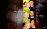
Spoilered for length (for PS)
I made the Gamekeeper image bar first, then put it on the background texture. So the tut is in two parts. I also fiddled a lot as I was making it, so there's a lot of layers built up to this...
Part the first: The Gamekeeper bit
1. Arrange the three caps on a new canvas, then make a stamp of all three to create a single layer with them all on.
2. Sharpen this layer with the smart sharpen tool.
3. Duplicate this layer. Go to 'Images > Variations' and lighten twice.
4. Duplicate that layer. Go to 'Filter > Distort > Diffuse glow' and then set the layer to soft light.
5. Make another stamp. Go to 'Filter > Other > High Pass' and then set that to soft light too.
6. Another stamp. Set to screen.
7. Add a new layer and fill with ebebeb. Set to color burn.
8. New adjustment layer - Hue/saturation. Increase the saturation to +20.
9. New adjustment layer - Selective color. Move the yellow slider up to 100% for greens.
10. New layer, fill with a3d39c. Set to color burn at 20%.
11. Add this texture on top, resize it to fill the whole area and rotate it so it's vertical. Blur it using the gaussian blur and set to screen.
12. Add this texture, again set to screen and position it across the boundary of the top two pics.
13. Add this texture, resized to fill the whole width, and set to screen. Position it at the bottom. Then duplicate it, flip the top one vertically and move up so that between them they cover the whole thing.
14. Hide all the texture layers you've just added, and make a stamp of the rest. Show the texture layers again and bring your new stamped layer to the top. Set it to 50% opacity.
15. New adjustment layer - Hue/saturation. Increase saturation to +20.
16. New adjustment layer - brightness/contrast. Increase brightness to +18 and contrast to +12.
17. Now the text. The fonts are Delicious and Mistral. Once you've put the text in, duplicate the text layer and then use the gaussian blur on the lower one.
Part the second: the wallpaper background.
18. Open a new wallpaper sized canvas and fill with black.
19. Make yet another stamp of all the picture layers (above) and move this onto your new canvas.
20. Use the select tool to cut out the vertical strip, and delete the rest.
21. Add this texture (resized to fill the whole canvas) on top of the background but under the picture strip. Set to screen at 50%.
22. Add this texture on top of that, flip it horizontally and again set to screen at 50%.
23. Add a drop shadow to your picture layer and voila! Finito
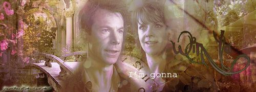
I made these from it....


Spoilered for length (for PS)
Spoiler:
I made the Gamekeeper image bar first, then put it on the background texture. So the tut is in two parts. I also fiddled a lot as I was making it, so there's a lot of layers built up to this...
Part the first: The Gamekeeper bit
1. Arrange the three caps on a new canvas, then make a stamp of all three to create a single layer with them all on.
2. Sharpen this layer with the smart sharpen tool.
3. Duplicate this layer. Go to 'Images > Variations' and lighten twice.
4. Duplicate that layer. Go to 'Filter > Distort > Diffuse glow' and then set the layer to soft light.
5. Make another stamp. Go to 'Filter > Other > High Pass' and then set that to soft light too.
6. Another stamp. Set to screen.
7. Add a new layer and fill with ebebeb. Set to color burn.
8. New adjustment layer - Hue/saturation. Increase the saturation to +20.
9. New adjustment layer - Selective color. Move the yellow slider up to 100% for greens.
10. New layer, fill with a3d39c. Set to color burn at 20%.
11. Add this texture on top, resize it to fill the whole area and rotate it so it's vertical. Blur it using the gaussian blur and set to screen.
12. Add this texture, again set to screen and position it across the boundary of the top two pics.
13. Add this texture, resized to fill the whole width, and set to screen. Position it at the bottom. Then duplicate it, flip the top one vertically and move up so that between them they cover the whole thing.
14. Hide all the texture layers you've just added, and make a stamp of the rest. Show the texture layers again and bring your new stamped layer to the top. Set it to 50% opacity.
15. New adjustment layer - Hue/saturation. Increase saturation to +20.
16. New adjustment layer - brightness/contrast. Increase brightness to +18 and contrast to +12.
17. Now the text. The fonts are Delicious and Mistral. Once you've put the text in, duplicate the text layer and then use the gaussian blur on the lower one.
Part the second: the wallpaper background.
18. Open a new wallpaper sized canvas and fill with black.
19. Make yet another stamp of all the picture layers (above) and move this onto your new canvas.
20. Use the select tool to cut out the vertical strip, and delete the rest.
21. Add this texture (resized to fill the whole canvas) on top of the background but under the picture strip. Set to screen at 50%.
22. Add this texture on top of that, flip it horizontally and again set to screen at 50%.
23. Add a drop shadow to your picture layer and voila! Finito


 Thanks!

 You don't need my permission
  The way around the transparent background is to match the background colour to the colour of background post. I know I have the colour code around here somewhere........*runz off to PS*.......I think its #f1f1f1


Comment