Announcement

Collapse
No announcement yet.

Sam Carter/Amanda Tapping Discussion/Appreciation

Collapse
X
 
  • Filter
  • Time
  • Show
Clear All
new posts

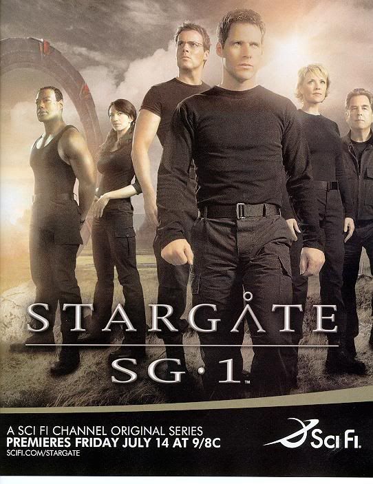
    Anyone else notice everyone is in body hugging shirts except Mitchell? Don't know what that means, but hey... it's a one of these things is not like the others gig. And sweet jesus thunk city on Carter there... someone shove Mitchell out the way k thanks.


    Originally posted by majorsal
    i hope so...

    i like the idea of whumpsam, but i *don't* like her paired with mitchell. anyone but mitchell.

    also, i saw a new full page add (got from another forum) -


    why look who's pushed up front of the cast?

    i better stop now, since i'm about to enter into mean and snotty territory.


    sally
    sigpic

    Comment


      Originally posted by majorsal
      i hope so...

      i like the idea of whumpsam, but i *don't* like her paired with mitchell. anyone but mitchell.

      also, i saw a new full page add (got from another forum) -


      why look who's pushed up front of the cast?

      i better stop now, since i'm about to enter into mean and snotty territory.


      sally
      I hear you, Sally. As for that pic...nice except who's up front. Maybe someone can photoshop it for us and fix it!

      Comment


        Originally posted by the dancer of spaz
        Well... Everything HAS kinda come full circle now that they have a hunk of a male lead on both series. If you remember last year's full page ad, it was pretty much the same configuration. They pushed JF to the front, had it so you could see ALL of RL's body, iirc, the main science guy looked pensive in the back, maternal figure right behind that and to the side, and the rogue alien guy is at the back looking decidedly... roguish.

        You'd think they'd have tried something new for the MOTHER series (and yes, I consider it a mother series - NOT a sister series - grr). I mean... seriously... Does ANYONE have a link to last season's Atlantis promo pic? It's almost identical in terms of "importance" and placement.
        so this 'jf' and 'rl' are from atlantis?

        **i just deleted a super snarky paragraph (or two) about why i think bb should not be lead of this show. why? because of wasn't proud of myself. and i'll shut up now.**


        thinks nice thoughts about sam and amanda. (and s/j ship )


        sally
        sally

        sigpic

        Comment


          Wow. That promo looks damn good. Hope the show is just as promising. Thanks for the link, guys.

          Live On Stage in Toronto - August 8,9,10 2008
          ~all proceeds to benefit charity~

          Comment


            Originally posted by majorsal
            so this 'jf' and 'rl' are from atlantis?
            Yep. Seriously, throw some ankle deep water in there (instead of the grassy landscape), and it'd pretty much be the exact same ad as Atlantis' last year. What happened to originality?

            Comment


              Well, we can be grateful that Sam is where she is and Vala is where she is. At least she hasn't been pushed too far into the background. Hey, I'm trying to see the bright side of things.

              Comment


                Originally posted by L.A. Doyle
                Well, we can be grateful that Sam is where she is and Vala is where she is. At least she hasn't been pushed too far into the background. Hey, I'm trying to see the bright side of things.
                Yes, but they showed all of CB's body for a reason. It's a clear - if not subliminal - point they're making about what purpose her character serves. They did it with RL last year as well... I just have to find the damn ad. THAT'S gonna bug me. I'm sure it's online somewhere.

                And though I'm glad AT/Sam isn't relegated to the "hot body" position, I really, really wish that CB/Vala wasn't either.

                Comment


                  Originally posted by the dancer of spaz
                  Yep. Seriously, throw some ankle deep water in there (instead of the grassy landscape), and it'd pretty much be the exact same ad as Atlantis' last year. What happened to originality?
                  Ah, you do realize we're talking about SciFi right? Okay nuff said
                  sigpic

                  my fanfic

                  Comment


                    Well, if Teal'c would switch places with Mitchell and scoot over, I'd get a clear view of Sam and Daniel(*drools*), and Mitchell and Vala would be hidden behind Teal'c's massive muscles. That could work.

                    That was a bit mean, I admit, but they could have taken a more team-like photo, instead of the "Cam and his friends" pic. And it DOES look like that Atlantis shot!

                    Comment


                      Ok some of you will probably hate this, but I started tinkering with the promo shot and ended up with this

                      sigpic

                      Comment


                        Originally posted by majorsal
                        i hope so...

                        i like the idea of whumpsam, but i *don't* like her paired with mitchell. anyone but mitchell.

                        also, i saw a new full page add (got from another forum) -

                        http://i31.photobucket.com/albums/c3...r/season10.jpg

                        why look who's pushed up front of the cast?

                        i better stop now, since i'm about to enter into mean and snotty territory.

                        sally
                        Anyone else think that the layout of this poster is really odd? I mean beside the fact that Mitchell is obviously THRUST once again into our faces. I know Amanda is rather tall for a woman, but doesn't Landry look like a dwarf beside her?
                        Last edited by ForeverSg1; 22 June 2006, 10:11 PM.

                        Comment


                          Originally posted by ForeverSg1
                          Anyone else think that the layout of this poster is really odd? I mean beside the fact that Mitchell is obvious THRUST once again into our faces. I know Amanda is rather tall for a woman, but doesn't Landry look like a dwarf beside her?
                          It's just too bad we can't dwarf Cam, you know shrink him right out of the show.
                          sigpic

                          my fanfic

                          Comment


                            I believe this was an excellent shot.
                            Spoiler:

                            That's back when SG-1 meant family. I miss those days...

                            Comment


                              Originally Posted by ForeverSG1
                              Anyone else think that the layout of this poster is really odd? I mean beside the fact that Mitchell is obvious THRUST once again into our faces. I know Amanda is rather tall for a woman, but doesn't Landry look like a dwarf beside her?
                              Without going off on some kind of weird, freaky art diatribe, um, yes. The entire compostion of the piece is hinky. The ad doesn't work because it has no spatial logic. This brings to mind something Pre-Renaissance along the lines of Cimabue or Berlinghieri, where the artist didn't know how to accurately convey a realistic space with depth, and instead fell back on hierarchical scaling to fill up the frame. The only difference is that back in the late 13th/early 14th century art hadn't moved beyond such rudimentary depictions.

                              Here in this piece, the characters were obviously just dropped in together against the background. Daniel is in the actual foreground relative to the others, but then Cameron is plastered over the foreground in a confused, slapdash manner. Even the placement of the rest of the characters is artlessly done. On top of all that, everyone's gaze is directed to a different spot. That automatically confuses the viewer, as does the mismatched poses of the characters. Teal'c and Vala point you to the left frame, Sam to the right, Landry faces straight ahead, Mitchell is moving to right, but Daniel is focused to the left distance. In short, there is no center, no focus to the ad, and therefore, no real meaning or underlying message trying to be conveyed. It's just a bunch of images pasted together. How professional.

                              ETA: Funny enough, this looks possibly like something I would come up with. This is not a compliment; the mistress of art, she visits me not. Seriously, I'm like Unas level here.
                              Last edited by golfbooy; 22 June 2006, 09:17 PM.

                              Comment


                                So you're saying there's a lack of focus and unity and point to it, conveyed with amateurish and stylistically lacking haste? Heh... sounds about right for the post RDA Stargate
                                [claps hands over mouth] did I say that?

                                Originally posted by golfbooy
                                Without going off on some kind of weird, freaky art diatribe, um, yes. The entire compostion of the piece is hinky. The ad doesn't work because it has no spatial logic. This brings to mind something Pre-Renaissance along the lines of Cimabue or Berlinghieri, where the artist didn't know how to accurately convey a realistic space with depth, and instead fell back on hierarchical scaling to fill up the frame. The only difference is that back in the late 13th/early 14th century art hadn't moved beyond such rudimentary depictions.

                                Here in this piece, the characters were obviously just dropped in together against the background. Daniel is in the actual foreground relative to the others, but then Cameron is plastered over the foreground in a confused, slapdash manner. Even the placement of the rest of the characters is artlessly done. On top of all that, everyone's gaze is directed to a different spot. That automatically confuses the viewer, as does the mismatched poses of the characters. Teal'c and Vala point you to the left frame, Sam to the right, Landry faces straight ahead, Mitchell is moving to right, but Daniel is focused to the left distance. In short, there is no center, no focus to the ad, and therefore, no real meaning or underlying message trying to be conveyed. It's just a bunch of images pasted together. How professional.
                                sigpic

                                Comment

                                Working...
                                X