
Slightly off topic - I just went on the website for the Ellen show. She has an area where you can suggest ideas, etc. I wrote a really nice piece on why she should have AT on her show....also I hear she is taking the show to Vancouver for a week in her new season. Now, if enough of you do the same (write not go to Vancouver - or both) we might be able to push it over the "perverbial" edge and get AT on the show....any volunteers!
-
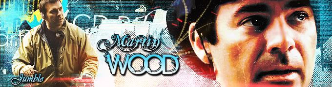
sigpic -
I've never quite understood all the fuss about getting Amanda on that show - care to explain?Originally posted by llp View Post
Comment
-
Pretty simple. She was asked at AT4 (I believe) is there anything (careerwise) that she would really love to do. She said she had always wanted to be on the Ellen show. She thought it would be fun, she loved her sense of humor plus she admired Ellen for all the charitable work she does. So since AT has gone a long way in making a lot of fans happy, wouldn't it be nice to return the favor, thus the push to get her on Ellen!Originally posted by Jumble View PostsigpicComment
-
Comment
-
Shhh. I'm peaking in and trying to do a quick catch up from work.
Woohoo! I think it's brilliant Jumble. I love the colors and I hope you'll share those fonts please.
As for the sharp yet pale...I think my scratch texture was more dark grey than black and white and had lots of scratches and smudges. I really wish I could find it for you. Try adding multiple ones or copies of the same one moved around and see if that helps. Or maybe try a dark grey solid color layer or the top and play with the blend modes and opacity? I think it might bring out the light texture a bit more too.
Congrats to the new Woohoo Aunties! Auntiedom is wonderful. Love 'em, play with 'em and hand 'em back when they're poopy or cranky. I'm glad I became an aunt before my kids were born. It was great practice.
llp I'd love to see AT on Ellen and would gladly fire off an email. Can you send me a link?
Welcome Nolamom! Did I really confuse you with that tut? Well, that's because I'm not the best teacher to learn from especially since that was very hastely written. We all started somewhere and if you decide to give PS a try, I'd be happy to walk you through it at a more leisurely pace.
Wendy - sorry you're not feeling well. (((Wendy))) Big congrats on your OU results!
Aaack! Gotta run. Boss is around the corner.sigpicComment
-
I have to tell you, 'peaking' is somewhat different to 'peeking'Originally posted by Estrela View Post I'm sure you really don't do that at work
ThanksWoohoo! I think it's brilliant Jumble. I love the colors and I hope you'll share those fonts please.
As for the sharp yet pale...I think my scratch texture was more dark grey than black and white and had lots of scratches and smudges. I really wish I could find it for you. Try adding multiple ones or copies of the same one moved around and see if that helps. Or maybe try a dark grey solid color layer or the top and play with the blend modes and opacity? I think it might bring out the light texture a bit more too. The fonts are Mutlu and Birth of a Hero, snurched from Josiane
I think it was a combination of the wrong scratch texture and not really knowing the right adjustments for the vivid light layer and the hue/saturation. But I actually like my result even though it's nothing like yours")
Comment
-
Evening all
Congrats to Wendy and get well soon EH-T and thanks for the tut Estrela and lovely sig Jumble and huggles to all
Oh, and an extra special appreciative hug and woop for Martin, because I just watched Divide & Conquer on Sky 2
sigpic
Artwork for All | Sig & avi by JadedWraithComment
-
Originally posted by Jumble View Post
 Oops. Thanks. You're right. I don't. *mutters to self about successful multitasking*
*claps* Yay! Thanks for the fonts! I've downloaded them both with the hopes that I can install them at home after the 4th technician works his not-so-magic magic to make my internet connection consistent.Thanks The fonts are Mutlu and Birth of a Hero, snurched from Josiane
I think it was a combination of the wrong scratch texture and not really knowing the right adjustments for the vivid light layer and the hue/saturation. But I actually like my result even though it's nothing like yours
I like your result too. It's much more you and that's oh so good.
I really don't want to work today.
*waves to Josi*sigpicComment
-
Originally posted by Estrela View Post
You're welcome, but do you also want the other ........ dozen fonts I downloaded whilst I was getting the links for those?*claps* Yay! Thanks for the fonts! I've downloaded them both with the hopes that I can install them at home after the 4th technician works his not-so-magic magic to make my internet connection consistent.
I like your result too. It's much more you and that's oh so good.
I really don't want to work today.
*waves to Josi*
And all the scratch textures that I found on deviant art..........
Thanks Yes, I guess you could say I Jumblified your tut
Comment
-
-
I think this one is closer to the tut.......


..... not convinced it's really 'me' though
Comment
-
I went back to the site and copied this address. It should take you right to the correct page. I even tested it to make sure. There is a lot of info on that page so it takes a few moments for it to come up, but it worked for me!Originally posted by Estrela View Post
http://ellen.warnerbros.com/show/respond/?PlugID=10
And because I have been so derelict on commenting recently, I will just pass on my congrats to those with newborns and my worry with those in need and my apologies for sounding so trite, but I haven't really had much time recently to do it properly nor the art skills to make it look good! But......
*A HUGE AND LONG HUGGLE * for those that need it or should be congratulated. Got to run.
sigpicComment
-
*is still avoiding work* Procrastination is a lovely thing. Just saying.
It may not be you but it stopped me in my tracks. I especially love the icon. (Gee, and I'm not a pink person.) I'd say you mastered my little tut quite nicely.Originally posted by Jumble View Post
Thanks for the link. If I tell two friends who then tell two friends.....Originally posted by llp View Post
sigpicComment
-
Pink? PINK??? I'll have you know that's lilac!!!Originally posted by Estrela View Post
Actually, it's growing on me............
Oh, and I have a little announcement........
WooHooooood!!!
Comment
-


Comment