 Thanks for the tut Egle! Will have to try some of those out (and the more new fonts
  )
)So, who're you gonna tag for a tut now?
 Thanks for the tut Egle! Will have to try some of those out (and the more new fonts )
 Well done for your first tut
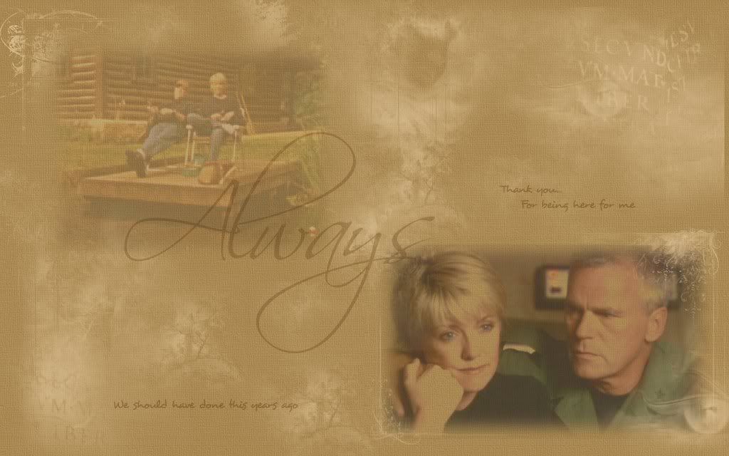
  ) ? As the thread is quite busy lately, its a bit difficult to track back to the original sig/wp. Could everyone post a pic of the subject of their tut at the beginning of that tut (sounds like toot toot
 ") ) just so everyone knows what it is? Thanks
) just so everyone knows what it is? Thanks


 And well done on your attempt Fainne
Me likes it.
And well done on your attempt Fainne
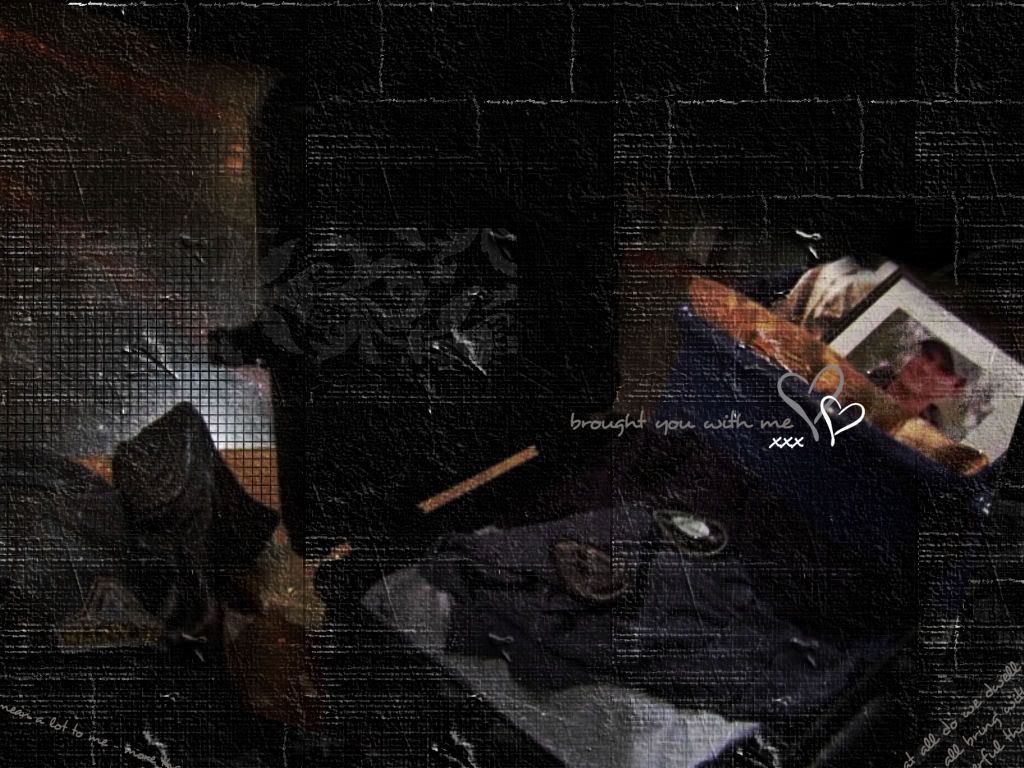
Me likes it.  For the record, I prefer wallies at size 1024 x something that would fit my screen.
 I thought I did it in this size. now i canged it. hope you like it now. and can you please tell me how you did the hearts? and give me the whole text you put in the corner of your wallie so i can add it? I can't read the first words of it

 )
)

Comment