
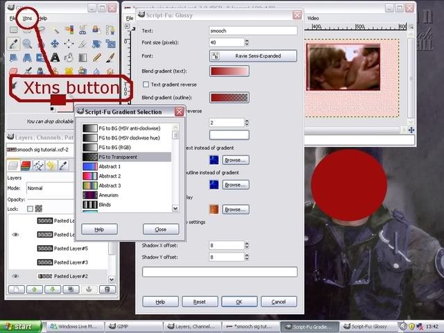
You all are very kind.  I do have the MOP brush and will add the little penguin before I put it on the MOP site. Might be a few days, though...we're hosting an office party at our house this weekend and significant prep is required between now and then.
  See you all on the other side!
I do have the MOP brush and will add the little penguin before I put it on the MOP site. Might be a few days, though...we're hosting an office party at our house this weekend and significant prep is required between now and then. See you all on the other side!

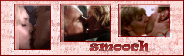
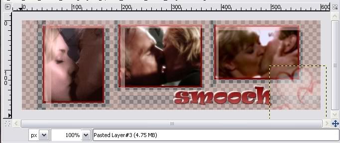
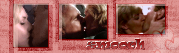
 Her fave colour is, yep you guessed, pink. I changed the pics for S&J...I made a few different versions of this one cos I couldn’t decide what other background colour to use
 ")


 I just talked to you on the family thread!


 Wow, it turned out really terrific (trying not to keep saying 'awesome'
  It really doesn't, don't worry
Comment