Announcement

Collapse
No announcement yet.

The secrets on how to make artwork of the Sam/Jack ship family thread

Collapse
X
 
  • Filter
  • Time
  • Show
Clear All
new posts

    Originally posted by Oma-1 View Post
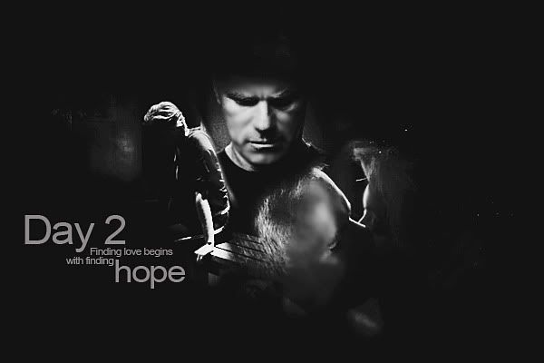
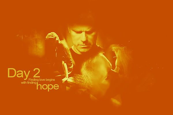
    Ooooh, LJ! Grungy, glowy and peaceful all at the same time! Love them The second one is definitely better, the colouring really makes an extra special....something


    *huggles Valerie* I wouldn't say your mojo has gone! You've got great ideas going on in all of those sigs And your trademark brushes and text

    Perhaps you could play around with some tuts that would help you to learn some new things. That always helps my mojo to wake up


    Thanks Kitten I was playing with the selective colouring, not having the faintest idea what I was doing After I posted it, I suddenly realised where I'd seen something very similar They say imitation is the biggest form of flattery

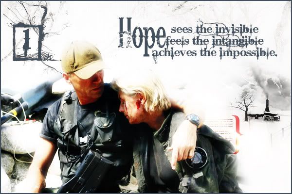
    *scratches head* The only time I can think of where Jack's holding a pic is Forsaken (S6). He finds it on the ground and you get a shot of his hand holding it, looking down on to the photo. I've seen manips where Sam's been put into the pic. Is that what you mean? I don't think I have a copy of it though.


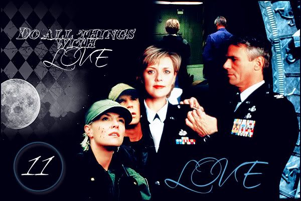
    You always use such wonderful textures and colouring Estrela, espeically in the first sig
    Thanks Oma. I'll have to try that.
    sigpic

    Comment


      Made 2 versions of day 2, don't know which one i like the most


      And a wallie that Estrela asked me

      Last edited by Blacky Kitten; 23 November 2010, 07:45 AM.
      sigpic

      Comment


        BKitten, I like the first one best! But, I'm the dark, grungy one, so...
        sigpic

        Comment


          I prefer the first one too
          sigpic
          My vids Sig made by me

          Comment


            LJ I love the first one the best, but I must say the second comes really close, they 're both awesome!
            Val Awesome banners!
            Estrela Ohhh nice and shiny! You should be sleep deprived more often!
            Blacky I like the black one the most! Looks more natural Thanks for making that banner WP size btw...so snurched!
            sigpic

            Comment


              Thanks for advise, ladies! So bw to be
              sigpic

              Comment


                LJ Forgot to say earlier that I really liked your challenge artwork - both versions. The light colored grunge made it look snowy and more wintery which seems so appropriate for an advent challenge.

                Originally posted by Blacky Kitten View Post
                Oooo. I love the B&W one.


                *bounces* Thank you! Thank you! Thank you!
                BIG virtual green!
                sigpic

                Comment


                  Late to the party but I like the B&W one too Blacky, the images are more striking I think. Well done ! Going to work on mine tonight, providing the mojo kicks into gear .

                  Comment


                    Originally posted by Estrela View Post
                    *bounces* Thank you! Thank you! Thank you!
                    BIG virtual green!
                    LOL! You welcome!

                    Originally posted by Sarai View Post
                    Late to the party but I like the B&W one too Blacky, the images are more striking I think. Well done ! Going to work on mine tonight, providing the mojo kicks into gear .
                    Not yet! I didn't send them to Josi yet

                    So, yeah, bw wins!
                    sigpic

                    Comment


                      I'm just gonna agree with everyone Kitty and say I love the B&W version!

                      My challenge entries


                      Plus 2 wps and an icon (one of the wp is from Trail of Blood and the icon is from Bank Job)


                      Spoiler:


                      sigpic

                      Comment


                        I need a good pic to go with the quote "Love is friendship set on fire." I can't seem to come up with a good pic for the advent calender. I have the background and everything else how I want, just can't seem to come up with a picture. Any suggestions?
                        Icon by AceofHadeon Sig by TrueRomantic

                        sigpic

                        Comment


                          Awesome artwork, everyone. I too am in the first one camp. Actually for both Blacky and LJ's entries.


                          My first attempt at day 16. Something's not right about it but can't put my finger on what. Perhaps I should just scrap it and start again completely differently? I'd appreciate concrit.

                          sigpic

                          Comment


                            Well, Day 16 is Peace, not Love. That could be the problem.
                            Icon by AceofHadeon Sig by TrueRomantic

                            sigpic

                            Comment


                              Oh wrong day. Maybe that's it. Doh!

                              Actually now I need to go check what days I put down for.
                              sigpic

                              Comment


                                LOL! If you put down for more than one I can see how you'd get confused. I had to look back to make sure I was right before saying that. But I figured if I'm 10 and I knew 12 was since I amost took it, 16 would be too many. Although, you can never have too much Love!
                                Icon by AceofHadeon Sig by TrueRomantic

                                sigpic

                                Comment

                                Working...
                                X