Announcement

Collapse
No announcement yet.

Artwork for All - challenges, graphics, tutorials

Collapse
X
 
  • Filter
  • Time
  • Show
Clear All
new posts

    Originally posted by Stargate78fan View Post
    Lovely artworks, XFchemist, Jumble, Nola, Syfyfan and Lg.

    Beautiful textures, Nola. I snurched the white wedding dress one and the bright light one (2nd texture).
    Thank you!

    Comment


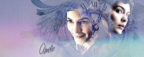
      How to make this sig:


      Spoiler:
      Start by creating a new document with 500x200 dimensions and the background layer set to black.

      Find your caps. I found mine here

      Use a layer mask on each of the caps to remove all of the background. I don't recommend using the eraser for this in any project as you may find in later steps that you may need some of the background. It really depends on your caps and the end result you want to achieve.

      (I know that I changed the coloring and brighness of these caps before placing them in my signature document but I didn't save what I did. Sorry. You'll want the coloring of both caps to match so either chose caps from the same scene or alter them so that they match each other best as you can. I have used the Image->Adjustments->Match Color commands with some luck in the past.)

      Add your caps to your document and resize them to your liking. Don't worry too much about blending and positioning until after the next steps.

      On a new layer over the caps, add texture #5 from this collection. Resize and position it offcenter in your document.

      Set the blend mode of this layer to lighten and reduce the opacity to 50%.

      You should now be able to see your caps underneath. Now is the time to reposition them and to mask any overlapping areas from those caps.

      When you're done with the cap layers, switch back to the texture layer and now mask away the areas over the faces. For this I used a soft round brush. I tried to use the round areas around the numerals on the clock face to my advantage by masking within those areas. You may need to vary the opacity of your masking brush to get a desirable effect.

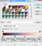
      Now add a new gradient map layer using this custom gradient


      Increase the contrast and deepen the darker colors by adding a color fill layer using color #e0e0e0. Set this layer to color burn at 100% opacity.

      Increase the brightness of the signature by adding a levels adjustment layer and modifying the levels to
      0,1,150 (Move the right slider to the left until you see the number underneath it read 150 or type 150 into the box on the right side.)

      Stamp a copy of all of the visible layers by pressing Control Alt Shift e.

      Sharpen this layer heavily. If needed, use a layer mask on this layer to remove overly sharpened features on the faces.

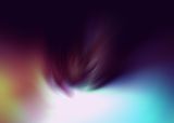
      Add this texture

      Position it and/or resize it to your liking. Then set the blend mode to screen and the opacity to 50%.

      Add the text. I used Saginaw font.
      To make it stand out against the background, I added a small drop shadow and a mild outer glow. Both used colors already found in the signature.
      sigpic

      Comment


        Spoiler:
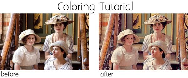
        The coloring is a simulation of HDR coloring in photography. There are many tutorials on the internet for it. The one I followed started with most of the steps outlined below. Somewhere in the middle of the tutorial though, I started experimenting on my own.


        First I recommend duplicating your original picture layer to preserve the original. You can turn off the visibility of it.

        The duplicate layer will now be your base layer. On the duplicate layer(base) follow the commands Image -> Adjustments -> Shadow/Highlight and use these values
        Shadows: amount 50%, tonal width 45%, radius 41 pixels
        Highlights: amount 83%, tonal width 76%, radius 1120 pixels

        Duplicate this layer and set the blend mode to color dodge. This will yield very saturated colors and light areas will now be white.

        Duplicate this last layer and set the blend mode to linear burn. Large areas of your layer will now be black. Which we will need to correct.

        Now comes a bit of a tricky part.

        Make sure your foreground color is set to black.

        Use the commands Select -> Color Range. Make sure the invert option is not selected and set the fuzziness slider to around 100. We're trying to select everything that is not black. Click ok.

        With the selection marked, create a layer mask. Do this by either selecting the small Add Layer Mask button (the one at the bottom of the layers palette that looks like a grey box with a circle cut out of the middle), or, follow the commands Layer -> Layer Mask -> Reveal Selection.

        Your picture is going to look a bit raggedy so we need to clean it up a bit. Make sure your new layer mask is selected by clicking on it. (You can tell it's selected when it's outlined.) Then apply a small gausian blur. (Filter -> Blur -> Gausian blur, use a small pixel amount)

        Duplicate the current layer (the one set to Linear Blur) and set the blend mode to Overlay.

        Select the layer mask of this layer and press Control i to invert the colors. (or use the long method Image -> Adjustments -> Invert) This will add contrast and deepens the shadows.

        Because each picture is different, you'll now need to adjust the opacity of the different layers. The tutorial I used suggested the best values per layer were Overlay layer 40%, Linear Burn layer 55% but experiment as each picture will differ.

        Duplicate your base layer and move it to the top. Set the blend mode to Screen.

        Add a new color fill layer with a dark blue color. I chose #091c3b. Set the blend mode of this layer to Exclusion. This is to tone down the contrast, add a soft yellow hue and to tone down the reds.

        At this point I thought I might have removed too much contrast so I added another new color fill layer. This one used a very pale grey (#ebeaea). I set this layer to color burn.

        To further soften the colors, create a new black to white gradient map layer. Reduce the opacity to 15%.

        The final step is to add another color fill layer filled with a very soft blue (#d6e6ff). Set this layer to soft light and reduce the opacity to around 35%. This layer was used to reduce the redness overall.
        sigpic

        Comment


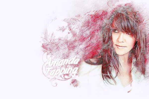
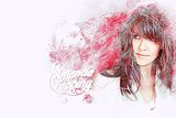
          Another promised tutorial. How to make


          Spoiler:

          Two things I need to mention: This was done in Photoshop CS3 and I can't locate the exact brushes I used for this.

          Start with a new 600x400 pixel document with a white background.

          Set your foreground color to black.

          Create a new layer and select an abstract brush with sharp angles. Perhaps something like one of these brushes
          and brush over the entire surface in black. You may need to vary the opacity of the brush you're using and/or modify the scattering properties. Try to concentrate most of the color wherever you're planning on putting your cap(s) later. Leave more space and use lighter brush strokes farther away from where you're planning on placing them too.

          Now find a cap you like and mask out the background. Adjust the coloring by whatever means you prefer as well.

          Add your cap to your document and set the blend mode to lighten.

          Chances are, not all of your cap will be visible at this point. So, create a new layer between your cap and your brush layer and with a smaller version of one of your abstract brush at low opacity, brush on the areas where you want your cap to show. Concentrate on the face and leave outer areas either untouched or only brushed over at lower opacities. This will soften the outer edges of your cap so that it blends in with the background more effectively.

          Stamp a copy of all visible layers by pressing Control Alt Shift e.

          Highly sharpen this layer. This is how you are creating the scratchy background. Use the blur or smudge tools at low opacity to even out skin areas if necessary.

          Set the blend mode of this sharpened layer to screen.

          Time to change the background color. Add a selective coloring layer and change the neutral values only to 100,48,22,3. Use a black brush on the layer mask of this layer to remove color on your cap where you feel it's too strong.
          (I tried using a red color fill layer set to blend mode=color but found I prefered the selective color layer method.)

          Add a hue/saturation layer and change the red values to -5,22,8. This will deepen the skin tones and deepen the background red color.

          Stamp a copy of all visible layers again by pressing Control Alt Shift e and set the blend mode to lighten.

          Create a new layer under this layer and fill it with white. With a black brush of your choice brush on the areas you want to keep. You can use a mask brush or create your own design. I used a combination of a mask brush and swirl brushes. Darker areas will show more detail. Use lighter areas around the outside of the design you want to keep. (Do this by lowering the opacity of your brush or by using lighter shades of grey.)

          To deepen the overall coloring and to add some contrast, create a new fill layer at the top in a soft pink color. I used #ecd1d1. Set the blend mode to color burn.

          To add a little more color (especially to the background), create another color fill layer using a dark green color (#152300) and set the blend mode to exclusion. Lower the opacity to 25%.

          Add your text. I used a font called ArtBrush.
          Add a small drop shadow in a dark red color chosen from your document. Also add a 1 pixel outside stroke in a very light grey color (#dedede) so that the text can be seen against the scratchy background area. I also used a warp text effect.

          And you're done.
          sigpic

          Comment


            You've been busy Estrela! They're all lovely.
            sigpic

            Comment


              Originally posted by Nolamom View Post
              thank you lg. I thought that the one with the sunlight through the trees was interesting - I inverted the trees before I added the sun because there was too much foliage at the top of them And the white one is actually part of the skirt of a wedding dress...
              Brilliant! Snurched!

              Thanks for those tuts Estrela - really love 'red' Amanda one

              Comment


                I've been waiting for that tut for the red Amanda one - thanks! The coloring one is beautiful too.
                sigpic

                Comment


                  Thanks for the tuts, Estrela!

                  Comment


                    Originally posted by maneth View Post
                    You've been busy Estrela! They're all lovely.
                    Thank you. I did get on a roll didn't I?

                    Originally posted by Jumble View Post
                    Brilliant! Snurched!

                    Thanks for those tuts Estrela - really love 'red' Amanda one
                    I love that one too and how it came about by accident. I was experimenting. Check out the new sig below.

                    Originally posted by ladygris View Post
                    Thanks for the tuts, Estrela!
                    You're welcome!

                    Originally posted by Nolamom View Post
                    I've been waiting for that tut for the red Amanda one - thanks! The coloring one is beautiful too.
                    Sorry it took me so long to write it. Hopefully it's not too difficult to follow. Please let me know if you have any questions though.

                    I looked everywhere for the brushes I used. I was sure they came from DA. Oh that's such a dangerous site for me. I get sidetracked so easily browsing and downloading from there.
                    sigpic

                    Comment


                      Evening all, I'll be making the challenge post shortly so if you have any last minute entries please send them now.

                      Can I make a quick request for the future regarding Tutorial Weeks - I can't remember if we mention this in the rules or not so it might be misleading but if you write a tutorial and post it on the thread, please send the LINK to that post rather than the post itself . That way we can just link to it in the challenge post, otherwise we have to go through and add in all the texture thumbnails that you have included and that sort of thing, which increases the number of pics in the post (there is a maximum or 20 pics allowed in one post)


                      Thanks all

                      Comment


                        Awesome work everyone, especially Nola with all those textures and Estrela with those fabulous tuts
                        sigpic
                        Artwork for All | Sig & avi by JadedWraith

                        Comment


                          Last edited by Sarai; 14 January 2012, 04:23 AM.

                          Comment


                            Let me know if I've missed any - as usual I probably have

                            Just putting together the next challenge

                            Comment


                              Beautiful artwork, everyone!

                              Comment


                                Challenge Week 19

                                The Big Two-Parter!


                                For the next couple of weeks we'll be doing a two-part challenge. The first week your challenge will be to create a texture. What with all these fabulous tuts Nola has been posting recently, it seemed like the perfect opportunity to push ourselves a little bit

                                Next week, you'll be using the textures in an arty. N.B. You won't be restricted to using the textures you make so if you really don't have time to enter this week but do next, you can use a texture someone else has made.

                                Size: Please make the texture wallpaper size if possible (around 1400 x 900 pixels)
                                Image: Any!
                                Text: Any, if appropriate to the texture

                                Please PM your entries to Jumble

                                Comment

                                Working...
                                X