Welcome to GateWorld Forum! If this is your first visit, we hope you'll sign up and join our Stargate community. If you have questions, start with the FAQ. We've been going strong since 2004, are we are glad you are here.
Announcement
Collapse
No announcement yet.
Graphic Arts Tutorials, Textures, Resources Thread
I took every single one and put it on my canvas. resized them, moved them around.
You should use pics with a dark background. It's easier to blend them.
Make sure there's some space around the person or object. Just look at my pics to see what I mean.
I set them all to lighten and erased everything I didn't want to have.
That means you may have to earse things form all the pics.
Not just the one you're just working with. You know? It's lighten. ;D
Makes things visible you don't want to have. It doesn't have to be perfect.
You can keep some parts like I did.
My base looks like that.
EFFECTS
Take CLOCK STOCK.
Desaturate. Resize to about 472x448.
Put it onto your canvas and set (guess what! ) to lighten 50%.
Erase they way you like.
Take THAT ROSE stock.
Resize it to about 375x500.
Put it above the clock and set to soft light 70%.
Erase once again to your liking.
Open that LIGHT BLUR.
Put it onto your canvas and set to lighten about 20%.
Once again...erase. ;D
Take that WINDOW LIGHT THING.
Put it onto your canvas as well. Set to lighten 30%.
Erase again. I didn't keep much.
Take that MOON TEXTURE.
I desaturated it -50.
Set to lighten 20%.
I reased almost everything in the middle. I mainly wanted to keep that outer stripes things.
You can merge everything now.
COLOR (no selective color ^^)
Spoiler:
Dublicate base and set to screen 30%.
RGB
point 1 input 101; output 140
point 2 input 132; output 183 Lookie.
*Filllayer
#d5c859 set to multiply.
Oppacity 100%; area 35%.
*Duplicate filllayer.
*New filllayer set to soft light #912326.
Oppacity 100%; area 31%.
*Merge Layers.
*Curves
point 1 input 90; output 101
point 2 input 121; output 148 Lookie.
Dublicate again, set to exclusion between 10% - 20%.
I used 20%. You can also skip that step.
TEXT
I used a quote from that scene (I almost broke my heart I tell ya!).
"What am I supposed to do?" in Felix Titling 30pt. Picked a color from the piece. (#A5937F)
Looked a bit empty so I used more from the quote. ^^
"I let down the people I love.
I let Dad down. And now I guess I'm just supposed to let you down, too.
How can I? How am I supposed to live with that?"
In Minion. Different sizes. Color #7F4F46.
And I gave all the text an outer glow. (layer > layer style > outer glow.)
In black. Normal 75%.
And because it looked empty I dublicated "What am I supposed to do?".
Rotated it 180°. And rotatet it again horizontal.
Merge layers and sharpen once.
I used an artistic filter > paint daubs > both settings to 1.
I think it looks better than sharpen.
Done.
Any questions please ask. It's actually not that difficult. Just very hard to explain. O_o
Thank you for paying attention. ^^
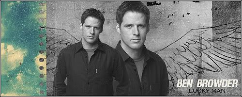
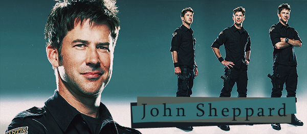
All righty... here's a Sheppard walli that I made with your tut Luci
Love all the new artwork from the new tutorials. Hopefully after next week I will have more time to play with the tutorials, as I finish my course tomorrow!! I love the new textures aswell, thanks for sharing them!!
Last edited by Stargate78fan; 28 March 2009, 06:04 PM.


 .
. 


Comment