
Originally posted by TrueRomantic
View Post
-
Thank you! I'll fix it.Icon by AceofHadeon Sig by TrueRomantic
sigpic -
Fixed
 Icon by AceofHadeon Sig by TrueRomantic
sigpicComment
-
You're welcome Twin!!!!!
But shouldn't there be two of the letter 'p'?sigpicSig by Ikorni for Secret SantaComment
-
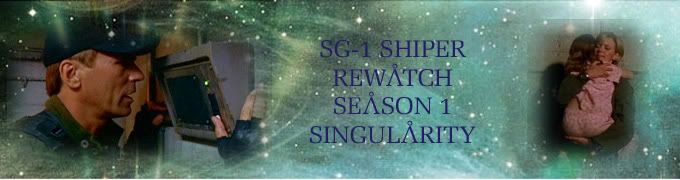
Okay, so like I said, I'm taking a break from the first LotS banner. But I've made a second one. And I must say, I think I like it better, lol.

Again, please EVERYONE tell me what you think. Thanks for helping me with this everyone. You're all fantastic!!sigpicSig by Ikorni for Secret SantaComment
-
Wooooo! Love the new banner, TR! Great blending! *does happy dance for TR*sigpicComment
-
Originally posted by TrueRomantic View Post
I love it!
My only suggestion is to see if you could mask/erase/blend (whatever) that little bit that's covering Richard's face around his left ear. It's distracting from the purdy view.
***
I was bored tonight. This was the result:
 sigpic
Comment
-
*joins the happy dance*Originally posted by luvnjack View Post
Thanks so much hon!! I'm sooo happy with it!!!
Thanks!!! Yeah, it's a bit annoying. Buy with the way I prepped the pic of Richard, I made that part of him a vit transparent. So I'd have to get rid of part of that pretty background, leaving just white under his ear, in order to make his ear more visable. But thanks soooo much for your input hon! And yes, it is a nice view, isn't it?Originally posted by Estrela View Post
And I love what you just made!! It's like funky, cool art!!
And I just made LotS sig for myself. And then I'll head to bed, since it's 3 AM for me...
 sigpicSig by Ikorni for Secret Santa
Comment
-
I'll follow Esrela and say there's far too much amazing stuff to multi-quote It's really incredible how far we've all come in the last year, well done everyone 
I made a new sig last night, not sure if the text is clear enough

Comment
-
Hi guys, I've made a couple of things for one of my uni projects and I can't decide whether to use the colour version or the black and white.
Any opinions greatly appreciated !!
!!

 sigpic
Artwork for AllComment
-
I prefer the second one Sarai, it's just more striking
Comment
-
Thanks JumbleOriginally posted by jumble View Post, after looking at it for a bit longer I think I prefer that one too. It will be more effective and hopefully...
Spoiler:sigpic
Artwork for AllComment
-
Good luck with that
Hmmmmm. 'Stairway to Heaven'.... that wood be in Martin's house, right?
Comment
-
Really? Yes, I'm using PS 7...Originally posted by Rachel-Kree View Post
*goes to check once again*
 My noise filter has only 4 options:
- add noise
- despecle
- dust & scratches
- median

I like the starry texture Padme
TR - now the text is easier to read
Cool artworks Estrela you're very creative")
Interesting quote Jumble maybe it shouldn't be on Martin's pretty face?
Sarai- this more coloured version looks more heavenly
sigpic
sig thanks to LuciComment
-
You mean the 4th one, with the white text? Thanks. But I'm still not happy with it. I'll be doing more tweaking eventually. But I decided to move on for now, which is how I made the 2nd banner for the contest and my newest sig, lol.
sigpicSig by Ikorni for Secret SantaComment


 .
.
Comment