Announcement

Collapse
No announcement yet.

The secrets on how to make artwork of the Sam/Jack ship family thread

Collapse
X
 
  • Filter
  • Time
  • Show
Clear All
new posts

    Originally posted by Egle01 View Post
    Yesterday I started playing with new series of banners. They're silly and aren't any good for using over S/J thread, but I got to test my new brushes plus I love this font to pieces. Got 2 of them finished, other banners are saved only as projects.


    I love the coloring in the txt on the first one! How did you do that?
    Slidell and I are re-watching SG1. Why don't you join us? SGBFFF-SG1-Rewatchsigpic
    You want to read Torn written by Slidell Yes... yes you do.

    Comment


      Originally posted by madaline_7 View Post
      I love the coloring in the txt on the first one! How did you do that?
      I selected the text layer, went to Layers > Layer Style > Gradient Overlay.


      Plus Drop Shadow and Stroke with size 2.
      sigpic

      Comment


        Originally posted by Egle01 View Post
        I selected the text layer, went to Layers > Layer Style > Gradient Overlay.


        Plus Drop Shadow and Stroke with size 2.
        Sweet! Gives me something new to play with.

        Thanks!
        Slidell and I are re-watching SG1. Why don't you join us? SGBFFF-SG1-Rewatchsigpic
        You want to read Torn written by Slidell Yes... yes you do.

        Comment


          You're welcome. This effect gives some very nice variations, IMO. But I never used Gradient like that with entire picture, until jas's tut.
          sigpic

          Comment


            Originally posted by Egle01 View Post
            You're welcome. This effect gives some very nice variations, IMO. But I never used Gradient like that with entire picture, until jas's tut.
            There have been so many tuts lately, that I am just taking one at a time and playing with it.

            Granted it takes me a while to put it in Mada understand speak... but I can usually get it within the day.
            Slidell and I are re-watching SG1. Why don't you join us? SGBFFF-SG1-Rewatchsigpic
            You want to read Torn written by Slidell Yes... yes you do.

            Comment


              Originally posted by m_wendy_r View Post
              Gimp really is addictive

              I was gonna leave it till after my holiday but I caved and tried to make another. It seems to blur slightly and I have no idea why

              It's not blurry in the programme or anything- it just seems to happen when I upload it.

              Spoiler:
              http://i48.photobucket.com/albums/f221/mtwendyr/shippyhippysig.jpg


              Yay for Mada!!
              You like purple, don't you???

              Originally posted by madaline_7 View Post
              Jann is in love with those pics! Looks good!
              tru to find someone who won't be... It looks wonderfull, Jann!

              Originally posted by hbt123 View Post
              Woo! Random sig time!

              Photoshop is fast becoming an obsession... why didn't I know years agothat it was so much fun?

              Snurchable
              http://i4.photobucket.com/albums/y146/hbt123/ATsig.jpg
              Awesome coloring!

              Originally posted by Egle01 View Post
              Yesterday I started playing with new series of banners. They're silly and aren't any good for using over S/J thread, but I got to test my new brushes plus I love this font to pieces. Got 2 of them finished, other banners are saved only as projects.

              [IMG]http://i262.photobucket.com/albums/ii114/Egle01/Artwork/notthere1.jpg

              http://i262.photobucket.com/albums/i...rk/looking.jpg[/CENTER]

              Egle, love new banners! Especially the first one, it's so funny!
              sigpic

              Comment


                Great new artwork folks.

                Originally posted by Egle01 View Post
                You're welcome. This effect gives some very nice variations, IMO. But I never used Gradient like that with entire picture, until jas's tut.
                I didn't even know gradient layers existed until Lies did a tut. I love this thread.

                Speaking of which. *pokes at Jann* I want a tut for this *points down* Pretty please.

                Originally posted by starlover View Post
                okidoki...Jann made a poster for the first time in....a while(she did got some help of her brother )

                Tada

                http://i16.photobucket.com/albums/b1...ackposter1.jpg
                (clickie for larger view)

                Is it alright? nothing changing? ...

                Last edited by jasminaGo; 14 August 2008, 01:24 AM.
                sigpic

                Comment


                  Art Thread, help!

                  I need some touch pick, it maybe not only hands touch, maybe like Jacks lays Sam's tummy his head in 'Serpent's Venom'. Something fluffy and good visible. Please?
                  sigpic

                  Comment


                    Originally posted by madaline_7 View Post
                    Jann is in love with those pics! Looks good!
                    Yup...I asked those pictures for a reason

                    Originally posted by Egle01 View Post
                    Yesterday I started playing with new series of banners. They're silly and aren't any good for using over S/J thread, but I got to test my new brushes plus I love this font to pieces. Got 2 of them finished, other banners are saved only as projects.

                    I like them...funny and good

                    Originally posted by hbt123 View Post
                    Woo! Random sig time!

                    Photoshop is fast becoming an obsession... why didn't I know years agothat it was so much fun?

                    Snurchable
                    http://i4.photobucket.com/albums/y146/hbt123/ATsig.jpg
                    Sweet! I really like it...and your style!

                    Originally posted by jasminaGo View Post
                    Speaking of which. *pokes at Jann* I want a tut for this *points down* Pretty please.
                    *sticks tongue out*

                    You sure? Really sure? I'll make one... But it has many, many layers...he he...

                    sigpic

                    Comment


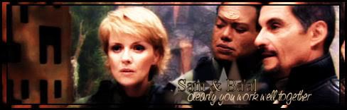
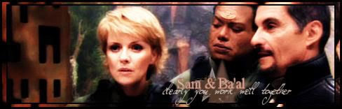
                      I made a Sam/Ba'al signature but i'm not really satisfied with the font. I am open for suggestions


                      Comment


                        Originally posted by Blacky Kitten View Post
                        Art Thread, help!

                        I need some touch pick, it maybe not only hands touch, maybe like Jacks lays Sam's tummy his head in 'Serpent's Venom'. Something fluffy and good visible. Please?


                        Comment


                          Fainne, you could try giving the text drop shadow or inner or outer glow, that sometimes makes it more clear. I think on the 2nd one, the clearly you work well together font is too girly ... But on the first one I really like the Sam & Baal font!

                          And yay for gradient layers!! I love them. I´m planning on making a geeky Sam sig, and someone asked for a RDA wallpaper ... but I don´t do wallpapers very often, they´re so big.

                          Jann, I love your wallpaper. The things I would have done differently:
                          Blur the texture on Amanda's face on the left
                          Loose the little Amanda on the right

                          But I love it, really. A stroke with little pics like that works very well with wallpapers eh.
                          sigpic

                          Comment


                            More touching pics


                            Comment


                              Jumble, thank you! How would i chose among all of them... Need to go

                              Edit: have you got hands-touching?
                              sigpic

                              Comment


                                Originally posted by SamJackShipLover View Post
                                Fainne, you could try giving the text drop shadow or inner or outer glow, that sometimes makes it more clear. I think on the 2nd one, the clearly you work well together font is too girly ... But on the first one I really like the Sam & Baal font!
                                thx... I had a break and now feel inspired enough to work that out

                                Blacky what about this? spoiler for size
                                Spoiler:


                                and THE picture also has a very nice hand-touching

                                Comment

                                Working...
                                X