
Originally posted by josiane
View Post
-
Thanks! It's supposed to. My next one is Woman I admire.Icon by AceofHadeon Sig by TrueRomantic
sigpic -
*waves* thanks JosiOriginally posted by josiane View Post . Ready for some much needed gimPing later
  !
!
gimp moan - I wish I could get the hang of using layers. tbh the whole thing just confuses me royally. I know they are really useful because then you can modify each separate bit of the picture but I can't get my head around it. And the gimp website is no help whatsover. I was wondering, for those of you who work in layers, is there a tut you have done on a previous page that I might have missed? Or could you post a new one? Pretty, pretty please? sigpic
Artwork for AllComment
-
The main thing with layers is to make sure you use them! Open up the layers dialogue box (CTRL+L or 'dialogues > layers' from the main gimp menu), which will give you a little box which lists all your layers. Then every time you paste in a pic go to 'Layer > New layer', and this will put it on a separate layer to your background/other pics. You can then see all your layers in the box, and use the arrows to move them above and below each other, change their mode (screen, overlay etc - I'm just starting to learn about this but basically you can get a lot of different effects by using this) and also change their opacity by using the slider in the box. Just always make sure that you have highlighted the right layer in the list when you do anything!Originally posted by Sarai View Post
Does that help for now? I can write a proper tut on one of my sigs that used lots if you like.sigpic
Artwork for All | Sig & avi by JadedWraithComment
-
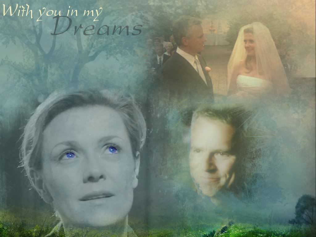
If you mean this sigOriginally posted by luvnjack View Post

I can't remember where I got it, but it was this (its big ) Snurch if you want
Spoiler:
I just used the top part, but I may use the whole thing for a wp.
Originally posted by josiane View Post") Just because you have that much space doesn't mean you have to fill it all, it means you can make it with a few big pics or little ones. You can do whatever you like with it Its just me that feels the need to put loads of pics and text in them
Just because you have that much space doesn't mean you have to fill it all, it means you can make it with a few big pics or little ones. You can do whatever you like with it Its just me that feels the need to put loads of pics and text in them  Look at some of Jasmina's, a lot of hers have two, three or four pics. Then she puts in frames, overlaps them and adds some text, maybe a few brushes, and they always turn out beautiful
Last edited by Jumble; 05 August 2008, 12:05 PM.
Look at some of Jasmina's, a lot of hers have two, three or four pics. Then she puts in frames, overlaps them and adds some text, maybe a few brushes, and they always turn out beautiful
Last edited by Jumble; 05 August 2008, 12:05 PM.Comment
-
Yeah and once you do get the hang of it, you are going to wonder how on earth did I do it before? LOLOriginally posted by josiane View Post
Just wanted to say, make sure you have the layer dialoge box open too. It helps ground you. (ok, helps ground me) when it comes to adding stuff.Slidell and I are re-watching SG1. Why don't you join us? SGBFFF-SG1-Rewatchsigpic
You want to read Torn written by Slidell Yes... yes you do.Comment
-
You wouldn't believe how long it took me to realise about layers I have always put every new thing in a new layer, but until I actually found the layers box, I didn't know that they could all be moved about, changed, added to, resized, whatever I wanted to do! What an eye-opener that was (thanks OMA )
Comment
-
Okay, tried an idea today and it didn't really work. It's a wallpaper. Idea was good, but the execution left much to be desired.
Spoiler:sigpicComment
-
Originally posted by madaline_7 View PostLol, me tooOriginally posted by jumble View Post I didn't get layers at all until I found the layers dialogue box (completely by accident one day, when randomly clicking on things!). Then suddenly it was like a great fog was lifted from my eyes and everything became so much easier
Sarai, if you still have trouble after you've found the box and everything, shout and I'll write up a tut for one of my sigs.sigpic
Artwork for All | Sig & avi by JadedWraithComment
-
luvnjack, when I first clicked on the spoiler and only saw the top part, I didn't know what you were on about, it looked gorgeous. Then I scrolled down and I see what you mean a little. It may be just me but the Sam and Jack heads at the bottom look slightly odd, a bit disconnected, like they've been decapitated Maybe try having more than just their heads there? That's all I can suggest. The top part with the wedding pic and the text is gorgeous though  sigpic
Artwork for All | Sig & avi by JadedWraithComment
-
I broke down and had to use *THAT* pic in a sig. I don't know if I like it as much as my old one so I'll probably end up switching back to my Keller one.Comment
-
Lol, welcome to the club Krissie! Nice job
sigpic
Artwork for All | Sig & avi by JadedWraithComment
-
oh yes, i'll try. You know i tried out some functions of PSP and hope I remember everything.Originally posted by josiane View Post And i hope to translate everything right because i use a german version of PSP XI
so here's the tut
Spoiler:
Comment
-
I think the Sam being in B&W there is what does it for me. But the top part id Brilliant!Originally posted by josiane View PostSlidell and I are re-watching SG1. Why don't you join us? SGBFFF-SG1-Rewatchsigpic
You want to read Torn written by Slidell Yes... yes you do.Comment
-
Thanks Fainne! I think I see how you did everything - I use gimp but I think I can translate most of that Will have to try some of it out!
sigpic
Artwork for All | Sig & avi by JadedWraithComment
-
actually I really like the ideaOriginally posted by luvnjack View Post but you are right, somehow the pic of Sam is a bit outstanding because it is black and white. Am I right if I guess you wanted to accentuate her blue eyes? if yes I'd like to suggest something if you don't mind
Spoiler:
you are welcome. i'm still learning myself. I really love the idea of this thread helping each otherOriginally posted by josiane View Post
Comment


Comment