Welcome to GateWorld Forum! If this is your first visit, we hope you'll sign up and join our Stargate community. If you have questions, start with the FAQ. We've been going strong since 2004, are we are glad you are here.
I don't know what's going on with the other one Maybe if you put it into PB and posted a link?
It's currently on my imgur account ( the "here" link). It's a cut out ( there's no background). I was avoiding taking things out of the original links for copyright and such reasons. *sigh*
I tried to look for different types of patterns to try to please everyone.
It's gorgeous, Estrela! Any chance of a tut at some point?
Thanks. I'll see about writing up a tut later. It'll be a bit of a challenge. I didn't have a plan and spent most of the time futzing with different methods and random textures I found online. (Which, it so happens, is how I do most of my artwork.)
It's currently on my imgur account ( the "here" link). It's a cut out ( there's no background). I was avoiding taking things out of the original links for copyright and such reasons. *sigh*
I tried to look for different types of patterns to try to please everyone.
No worries, I'm sure there is enough variety in the ones we've got
Thanks. I'll see about writing up a tut later. It'll be a bit of a challenge. I didn't have a plan and spent most of the time futzing with different methods and random textures I found online. (Which, it so happens, is how I do most of my artwork.)
*waves* been so long since I've posted anything, I've forgotten how to do it! Also, pretty sure I've forgotten everything I ever knew about GIMP too .... but I am so happy to see you all still here, still posting your awesome art, and challenge week 150?!!! WOW! Well done all for keeping this forum going for so long
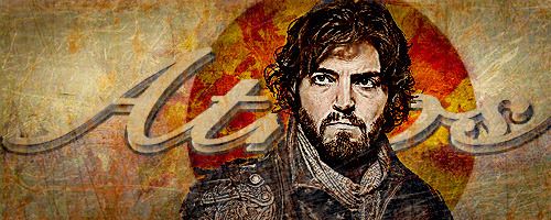
First a few notes: I use PS. I don't know how well this would work for GIMP. This probably works best with subjects that have lots of dark colors. Also, I couldn't locate all of the exact textures I used for this.
Create a new sig sized document. Mine is 500 x 200 pixels.
Fill the first layer with white.
Place your subject on a new layer. Remove any background by masking or erasing.
Copy your subject layer 2 times and turn off the visibility for the top 2 layers.
Desaturate the first subject layer (the bottom one).
Sharpen this like crazy (but not so that it's pixelated) by whatever means you like best.
Turn on the visibility of the second (middle) subject layer. Change the blending mode to Linear Dodge and reduce the opacity to 60%.
Now to add back some color.
Add a new layer above the middle and top (not visible) subject layers and fill it with a brown color. I used #593c24. Set this layer's blending mode to Soft Light.
Add a new layer above the color layer and and fill it with a yellow concrete or stone texture like this one. Sorry, I couldn't find the one I used.
Reduce the opacity just so you can see the layers beneath it temporarily and mask or erase the area over the subject's face and any other areas you'd prefer to be lighter in color than your texture color. Use your eraser or masking brush at 50% or lower opacity. You want to be able to reveal the layers below but still leave some yellow color behind. Turn the opacity back up on this layer when you're done. This layer helps create skin tones.
Turn on the visibility of the top subject layer and set the blending mode to multiply.
Now for the remainder of the background.
Select the elliptical marquee tool and create a new layer under the first subject layer. Draw a circle behind your subject. Fill this with a soft yellow color (#bd985d) and set it to blending mode Color Burn. Double click your layer to add blending styles and add an inner shadow in a brown color set to multiply at 75% opacity. Set the Distance=5, choke=0, size=25.
Under this layer add some autumn leaves like these or these. (I can't find the ones I used.) Set them in the circle you just made and the along bottom of your artwork. Transform them to change the size and rotation as necessary. Play around with the blending modes and opacity. I had to use multiple layers of leaves and set the ones in the circle to Color Burn at 33% while the others were set to Linear Burn at 30% opacity.
It's time to add text.
Above all of your layers add a new text layer. Chose a font and add your character's name. I used CygnetRound as my font.
Transform your text layer so that it stretches across the width of your artwork and is as tall as you desire. Add a layer mask and mask away the text that overlaps your character.
Make a copy of the text layer and temporarily turn off the visibility of the top text layer.
On the lower text layer, double click the layer to add layer styles and add a Bevel & Emboss style with these settings:
Style: inner bevel
technique: smooth
depth: 100%
direction: up
size: 5
soften: 0
everything else should be left as the default settings.
Also add a 3px stroke on the outside in black.
Turn on the visibility of the top text layer and double click to add layer styles. To this layer just add a drop shadow with these settings:
blend mode: multiple
color: black
opacity: 75%
Distance: 5px
Spread: 0%
Size: 5px
Now move your top text layer a few pixels up and to the right until you create a 3D type effect.
Create a new layer above the text layers. Set the blend mode to Multiply. Select a soft, medium sized brush and a 50% grey color. Brush along the outside edges of your artwork to create a vignette effect and draw attention to your subject. Lower the opacity if desired.
Add a new layer on top of everything and add this metal texture. Transform it so that it covers your entire artwork. Set it to Soft Light and mask or erase over your subject's face.
Above the metal texture layer add this scratched texture. Transform it so that it covers your entire artwork. Set the blend mode to Screen and lower the opacity to your liking. Mask or erase the area over your subject's face.
Add an adjustment layer and darken the blacks and adjust the midtones darker as well. You can also use a levels, exposure or curves adjustment layer for this. Go with whichever you're most comfortable using.
Add a Hue/Saturation adjustment layer as your top layer and increase the saturation to your liking.
Done!
I hope someone finds this useful. Need clarification or have a question? Please don't hesitate to ask.


")


Comment