
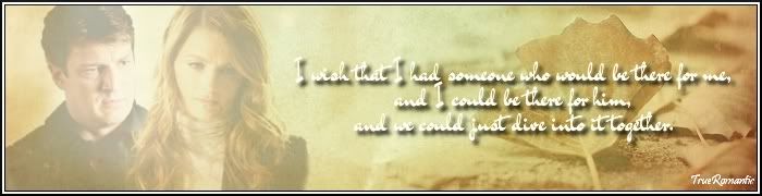
Here's the tut M asked for.
To make this:
Note: This was originally based on this tut by josiane. I wound up going my own way on the textures and such, coming up with this one.
If you have any questions, please ask!
To make this:
Note: This was originally based on this tut by josiane. I wound up going my own way on the textures and such, coming up with this one.
Spoiler:
You will need: 


Open your canvas to whatever size you need. All of these textures are quite large, so they work really well for wallies as well as sigs. Fill your background with white.
Add first background. Scale so that the entire bow is in the artwork and set it off to one side. If necessary, duplicate and blend so that you've got a solid background. If necessary, merge layers.
Using the smudge tool, smudge out the grungy texture of the background. Be careful around the bow to leave the tie but to remove the texture.
Open your character pic, in my case, the one of Daniel. Scale and position as desired, then erase the background. Duplicate that image, and set the new layer to Overlay, opacity 40%. This adds a bit of warmth and definition to the picture.
Add the Sunset background. Reverse it so the sun is on the right side of the artwork, near the bow. If necessary, resize. Set to Overlay, opacity 100%. Using the smudge tool again, carefully smudge only the portion of this texture that is over your character. You want to keep the color changes by the fading sunset without the actual texture being over the person.
Add the glow texture. Scale and position as desired. Set to Screen, opacity 100%.
Add the bokeh texture. Scale and position as desired. Set to Screen, modifying your opacity as you see fit.
Layer—New from Visible.
Coloring
Text
For “Remember Me,” I used Champagne in color #ca917c. It will blend with the background, but don't worry. It'll be very obvious by the time you're done.
Using color #fad8ba, set your paintbrush mode to Soft Light. Using a medium-sized round brush, go over the top of the words once or twice, just enough to lighten them to an almost white color.
In color #4c193d, type in the same words. Put them directly over your modified layer and set to Overlay, opacity 100%. This will give a nice purpley look to the words without losing the brightness.
For “When the color of a sunset fills the sky,” I used Champagne and Limousines in color #ca917c. Then, using color #fad8ba and the same soft brush on Soft Light, I went over all the words, brightening them.
Add a drop shadow to all of the text in color #3a284e with the following settings:
Offset X: 0
Offset Y: 0
Blur radius: 20
Do not allow resizing.
Layer—New from Visible.
Sharpen the entire thing, and you're done.


Open your canvas to whatever size you need. All of these textures are quite large, so they work really well for wallies as well as sigs.
Fill your background with white.Add first background. Scale so that the entire bow is in the artwork and set it off to one side. If necessary, duplicate and blend so that you've got a solid background. If necessary, merge layers.
Using the smudge tool, smudge out the grungy texture of the background. Be careful around the bow to leave the tie but to remove the texture.
Open your character pic, in my case, the one of Daniel. Scale and position as desired, then erase the background. Duplicate that image, and set the new layer to Overlay, opacity 40%. This adds a bit of warmth and definition to the picture.
Add the Sunset background. Reverse it so the sun is on the right side of the artwork, near the bow. If necessary, resize. Set to Overlay, opacity 100%. Using the smudge tool again, carefully smudge only the portion of this texture that is over your character. You want to keep the color changes by the fading sunset without the actual texture being over the person.
Add the glow texture. Scale and position as desired. Set to Screen, opacity 100%.
Add the bokeh texture. Scale and position as desired. Set to Screen, modifying your opacity as you see fit.
Layer—New from Visible.
Coloring
Spoiler:
For this, you'll need both curves and color balance.
Curves
Value: 87, 81
142, 149
Color balance
I completely forgot to write down my settings on color balance. So, I can tell you that I didn't do anything with Highlights. With Midtones and Shadows, I upped the reds and yellows to give it that really plum-red color.
Curves
Value: 87, 81
142, 149
Color balance
I completely forgot to write down my settings on color balance.
So, I can tell you that I didn't do anything with Highlights. With Midtones and Shadows, I upped the reds and yellows to give it that really plum-red color.
Text
Spoiler:
For “Remember Me,” I used Champagne in color #ca917c. It will blend with the background, but don't worry. It'll be very obvious by the time you're done.
Using color #fad8ba, set your paintbrush mode to Soft Light. Using a medium-sized round brush, go over the top of the words once or twice, just enough to lighten them to an almost white color.
In color #4c193d, type in the same words. Put them directly over your modified layer and set to Overlay, opacity 100%. This will give a nice purpley look to the words without losing the brightness.
For “When the color of a sunset fills the sky,” I used Champagne and Limousines in color #ca917c. Then, using color #fad8ba and the same soft brush on Soft Light, I went over all the words, brightening them.
Add a drop shadow to all of the text in color #3a284e with the following settings:
Offset X: 0
Offset Y: 0
Blur radius: 20
Do not allow resizing.
Layer—New from Visible.
Sharpen the entire thing, and you're done.
If you have any questions, please ask!


Comment