Awesome entries Josi 
What font is that for 'Josh Lyman'?
What font is that for 'Josh Lyman'?

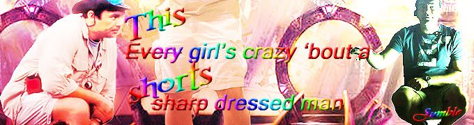
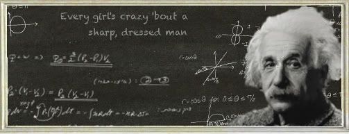
 LOVE this ... the sigs themselves and the subject matter. Not long now before Conan starts The colour on the B&W as well as the fonts and the pic choices all comes together perfectly.
 Also the texture and the font names had me grinning. We did a 'team' challenge a while back where we each had an element - I was so tickled for my team because I already had a font called 'Air' to line up with our element

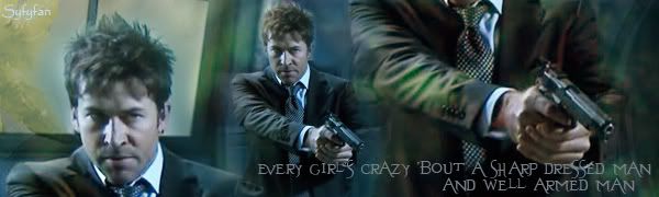
 Love it, Sha!
 So I ask you to refrain from posting for a few seconds while I post the placeholders.


Comment