Announcement

Collapse
No announcement yet.

Artwork for All - challenges, graphics, tutorials

Collapse
X
 
  • Filter
  • Time
  • Show
Clear All
new posts

    Originally posted by Hyndara71 View Post
    One question: Have the bookmarks to be 600x180 pixels? Because I usually do bookmarks 400x125 pixels (better size for printing). And usually my sigs are 150x600 pixels - just saying
    No, that was just an example You can make them any size you like as long as they're long and thin, like a sig turned on its side.
    sigpic
    Artwork for All | Sig & avi by JadedWraith

    Comment


      Okay, thanks .

      Original eBook:Der Spuk im Rosenhaus
      Sig & Avi by Josi
      sigpic
      LJ, FanFic-Blog(the longest lasting German SG-fanfic series), Profile at ff.net, Profile at FF.de,Profile at deviantART (Sorry, fanfics mostly in German)
      I'm on Twitter and on Facebook Tumblr and AO3

      Comment


        Banner by Sarai

        Tutorial Week 17

        Tut by ladygris

        Josiane


        Hyndara


        Ikorni


        Tut by ladygris

        Rocket Scientist


        Tut by Josiane

        ladygris


        Tut by Sarai

        ladygris


        Two tuts from Shadowplay: One | Two

        ladygris


        Tut from Shadowplay

        Ikorni


        Master list of all the tuts shared this week
        sigpic
        Artwork for All | Sig & avi by JadedWraith

        Comment


          Except one I love the entries .

          Okay, no challenge but ... was in the mood for some more GrimmArt:


          Original eBook:Der Spuk im Rosenhaus
          Sig & Avi by Josi
          sigpic
          LJ, FanFic-Blog(the longest lasting German SG-fanfic series), Profile at ff.net, Profile at FF.de,Profile at deviantART (Sorry, fanfics mostly in German)
          I'm on Twitter and on Facebook Tumblr and AO3

          Comment


            I made these to complete the set.


            sigpic

            Comment


              Very nice Mane - I think you've given us the perfect demonstration of how versatile one pic can be

              Comment


                Thanks! Couldn't resist that smile!
                sigpic

                Comment


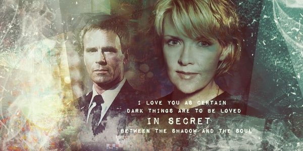
                  Again... I love everyone arts. And I love the text in the first Jack and Sam wallie. So them. Hopefully I have time.. and remember... to attempt challenge this week. Miss doing this.

                  Comment


                    Wonderful arts, everyone!

                    Okay, here's the tut that Sarai asked for. Sorry it took me so long to make this up. I had a prayer summit for church this weekend....

                    To make this:

                    NOTE: I used a combination of PS CS2 and Gimp to make this wallie. It contains selective coloring, and it can be made entirely in PS. I just didn't have the time to mess with some of PS's more unique quirks.

                    Spoiler:
                    You will need:

                    1. Two headshots of your character(s)/actor(s). This set design works best with shippy art.

                    2. These stocks:

                    I used Gimp to put all of this together, so this part is for Gimp. As a result, I just used the “Open as Layers” option in the File menu. Also, to get the precise placing of the images, I used Gimp's handy little “guide” system. With the little arrow selected to move the images around, go above your canvas (where the ruler is) and drag down. You should wind up with a blue or red dotted line going across your canvas. Place this halfway down, using a bit of trial and error and math to find dead center. Then, go over on the left side of your canvas with the other ruler and drag to the right. Another one of these guides will appear, and again find the center. This way, your two main images will have corners that will line up perfectly. (Or, you can check out bailey1ak's post directly under this for an obviously easier way I didn't know about! )

                    Open your first stock, the blurry Eiffel Tower. Scale to fit your canvas and place in the center, using those handy rulers.

                    Here's where it gets very complicated to explain my process. Just open your character pics and arrange them to your liking. I used a “pinwheel” pattern, so to speak, with them. But these can be put on the screen any which way.

                    Now, open the second stock, the Eiffel Tower through the cherry blossoms. Scale, crop, and position as you want and to fill in your picture pattern. I like using only small pieces of city-scapes in a design like this.

                    Open the third stock, the Eiffel Tower with the river, and do the same thing.

                    Open the fourth stock, the New York City stock. Go to Colors-->Desaturate. Check the “Luminosity” option. Scale up until it more than fills the canvas, set to Overlay, and move this image below all of the cropped images. (It should only cover the blurry Eiffel Tower.) Position it where you like the bokeh effect.

                    Open that stock again. This time, scale up until it covers the crops. Do not desaturate! Go to Filters-->Blur-->Gaussian Blur. Raise the two points to around 15. Set this layer to Screen, opacity 50%. Using the smudge tool, blur out any of the bokeh that's over the faces. Erase anything that is over the background. You only want this layer over the crops, not the background.

                    Now, go to Layer-->New Layer. Select “Transparency.” Using your Airbrush tool in the toolbox, paint this layer with color #6d4a41. You want the entire screen covered, but not evenly. Set this layer to Overlay, opacity 100%.

                    Merge all the cropped images--not the textures or color layer over them--and add a drop shadow. (Filters-->Light and Shadow-->Drop Shadow. Make sure the "Allow Resizing" button is not selected.)

                    And you're done in Gimp. At this point, you can color this in Gimp however you want. I saved it as a .jpg file and transferred it over to PS CS2 for coloring.

                    After opening in CS2, add a selective color layer.
                    Reds: -25, 0, +12, -28
                    Yellows: 0, 0, +100, 0
                    Whites: -7, +7, 0, +30
                    Neutrals: +2, -1, -2, 0
                    Blacks: +12, -3, -5, +5

                    Add a Hue/Saturation Layer
                    Reds: Saturation +4
                    Yellows: Saturation -59, Lightness -6

                    Add a Curves Layer
                    Input: 124, Output: 115

                    Add a second Selective Color Layer
                    Reds: -17, 0, +10, +6
                    Whites: +6, 0, +7, 0
                    Neutrals: +4, 0, -5, -1
                    Blacks: -7, 0, +7, +2

                    Add a Photo Filter: Sepia.

                    Make a stamp and add your text. I used Delicious, all lower case, in colors picked from the stamp. For "marta," I went with a pink, and I used a blue for "aaron." If necessary, add a second layer to the text in a dark brown chosen from the background. Use Ctrl + an arrow key to nudge them so they form a second layer to the text. (Thanks for the tip, Nola! I use it all the time!)

                    Open your fifth and final image, the green glow. Go to Image-->Adjustments-->Desaturate. Set to Screen and place right behind your text in the center of your canvas. Use Free Transform as needed to squish it and arrange it so it highlights your text. I also used a fuzzy eraser to blend the edges so there weren't any odd lines.

                    Make a stamp.

                    Add a final Selective Color Layer.
                    Reds: -7, 0, 0, +7.

                    And you're done. If you have any questions, feel free to ask!


                    Whew! And that's my first PS tut!
                    Last edited by ladygris; 12 January 2013, 07:22 PM.

                    Comment


                      Loved all of the art recently posted! Have greened where GW would let me.


                      Love the wallpaper, ~lg!!

                      I was reading your tut and saw your part about the guides in Gimp. You can also find the center for the lines by choosing the pull down for tab Image. At the bottom is the guides. You can then choose by percent for horizontal or for vertical. You may know this all already... but it doesn't hurt to make sure.

                      Your wallpaper is beautiful! Might have to give that one a go sometime in the future.
                      sigpic

                      Comment


                        Originally posted by bailey1ak View Post
                        Loved all of the art recently posted! Have greened where GW would let me.


                        Love the wallpaper, ~lg!!

                        I was reading your tut and saw your part about the guides in Gimp. You can also find the center for the lines by choosing the pull down for tab Image. At the bottom is the guides. You can then choose by percent for horizontal or for vertical. You may know this all already... but it doesn't hurt to make sure.

                        Your wallpaper is beautiful! Might have to give that one a go sometime in the future.
                        Thanks.

                        See, that's something I didn't know. I'll have to look at that when I've got Gimp open next.

                        Comment


                          In PS you can use the shortcut - CTRL + R for the guides, right click to choose pixels, inches, percent, etc.

                          great tut!
                          sigpic

                          Comment


                            Originally posted by Nolamom View Post
                            In PS you can use the shortcut - CTRL + R for the guides, right click to choose pixels, inches, percent, etc.

                            great tut!
                            Is this in PS or Gimp? 'Cause, when I put the wallie together, it was in Gimp.

                            Comment


                              I only use PS, so this is in Photoshop.
                              sigpic

                              Comment


                                Originally posted by Nolamom View Post
                                I only use PS, so this is in Photoshop.
                                True.

                                I still haven't gotten comfortable enough with PS to put the artwork together in PS. I'm still partial to the easier way of Gimp.....Having to paste the image into the art is a little frustrating to me when I'm used to just opening it up in the artwork itself.

                                Comment

                                Working...
                                X