Originally posted by maneth
View Post
Announcement
Collapse
No announcement yet.
Artwork for All - challenges, graphics, tutorials
Collapse
X
-
-
Hey, everyone! Here's the tut Jumble requested.
To make this:

Spoiler:You will need:

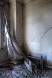

And character image(s). PB was being a nuisance today, so I didn't upload them.
Open your canvas and fill with white. Add first texture. Set to Normal.
Add pic of beach. Scale and position, using the right side of your artwork as your guide. Use a layer mask from left to right to fade a portion of the image, letting the first texture show through.
Duplicate your first texture and drag to the top of the list. Set to Overlay, Opacity 100%. Use a layer mask from right to left.
Add second texture, the tattered curtain. Scale up and position where you want it. Set to Screen, opacity 100%. Erase what you don't want showing.
Duplicate screened layer and flip horizontally and vertically so it shows in the opposite corner.
Duplicate your first texture again and add it to the top. Set to Burn, Opacity 60%. With this layer, you might experiment with moving the texture around, flipping it horizontally, or however you want to add a touch of the pink on other parts of the artwork.
Either flatten the image or make a new layer from visible. I tend to make a new layer from visible so I can change things around later if I don't like it.
Coloring
Spoiler:For Color Balance, I've just put down the numbers. That's from top to bottom, Cyan/Red, Magenta/Green, Yellow/Blue.
Color Balance:
Highlights: 51, 56, 54
Midtones: -15, 1, 6
Shadows: 12, 1, -9
Curves:
Value: 95, 75
174, 147
Red: 70, 93
177, 167
Green: 84, 78
175, 160
Blue: 81, 82
174, 152
At this point in time, your artwork will look very bright. Don't worry, it'll tone down.
Add a new color fill layer, color #466165. Set to Color, opacity 41%.
Add another color fill layer, this one color #bd9a6d. Set to Hard Light, opacity 76%.
Add third texture. Set to Screen, opacity 100%. Scale and duplicate as necessary, erasing what you need to erase in order to show the flowers.
Add your character pics, erasing their backgrounds. You can fiddle with their colors however you'd like.
Add your text. For “Daniel” and “Janet,” I used Callie Hand. For the “&” sign, I used Saginaw. (I couldn't find a link. Sorry! ) Add an outer glow of a different color and/or drop shadow of color #9f7169 if you want.
And you're done. Feel free to ask me any questions you might have. sigpic
To Hope Again
Comment
-
Love the egg-WP, Nola!
Great sigs, lg!
The pics from the con in Malmoe made my muse coming back to me:


Original eBook:Der Spuk im Rosenhaus
Sig & Avi by Josi
sigpic
LJ, FanFic-Blog(the longest lasting German SG-fanfic series), Profile at ff.net, Profile at FF.de,Profile at deviantART (Sorry, fanfics mostly in German)
I'm on Twitter and on Facebook Tumblr and AO3
Comment
-
And here's the tut that mane requested.
To make this:

Spoiler:This banner is suprisingly simple. I might make a matching wallie out of it later this evening.
You will need:


Open your canvas and fill with white.
Add the texture. For this, I didn't rescale it and used the very bottom edge, where the gray fades to black.
Add the first image of the SG-1 cast. I don't think I resized that at all, either. I cropped Daniel/Michael Shanks out of it, erasing the background. I also lightened the pic.
Add the second image of Daniel. This one, I actually darkened so it looked closer to the first image. Erase the background and scale to however you want it.
Duplicate your texture, set to overlay, and drag to the top. I erased the part over Daniel, so you might not even need to drag it.
Add your text.
Spoiler:For the Ancient script, I used a font similar to Ancient G with a classic Daniel Jackson line: If you immediately know the candlelight is fire, then the meal was cooked a long time ago. I did this in color #d3d3d3. Place this text between the two texture layers.
For his name, I used color #d3d3d3 to begin. For "Daniel," I used Callie Hand. For both of these words, I duplicated the text. Alpha to Selection. Select-->Grow. Grow it by one pixel. Paint that grown layer with black. Select-->None. Move the grown layer behind the original one.
Duplicate the original text layer again and change the color to a darker gray. Then, with a large fuzzy eraser, brush the top of the layer, erasing away and showing the lighter color underneath.
Using the same fuzzy eraser, set your paintbrush to Soft Light mode. Lightly brush the bottom of the dark gray ext layer with black. This gives that faded appearance.
Add a black drop shadow behind all the text. And you're done!
Feel free to ask if you have any questions.
Edit: For some reason, GW cut off part of this tut. The font for "Daniel" is Architect's Daughter. The font for "Jackson" is Callie Hand, like noted in the tutorial.Last edited by ladygris; 06 March 2012, 01:44 PM. Reason: Some formatting issues and to add a missing link.sigpic
To Hope Again
Comment
-
You're welcome, Jumble.Originally posted by Jumble View PostThanks for the tuts lg *adds to list*
 sigpic
To Hope Again
Comment
-
Adding to the epic quest for tuts as kindly requested by Jumble and Josiane
Spoiler:We start out with a blank canvas and in my case this pic:

-Erase the background (or cut out the object of your obsession) and set the layer to fit the canvas. Now copy and paste so you have two layers. Desasturate the upper layer and set the colours in the lower layer to very vibrant and sharpen to the point you might feel it’s just a tad too much.
-Set he grey layer on a visibility that softens the vibrance and sharpness of the bottom layer. Add a soft glow If you’re satisfied... blend! Remember at this point that you have a poo load of layers covering the pic later. (Hence the ‘’very vibrant and a tad too sharp’’).

It's sharper in RL
(It’s a personal favorite technique but use whatever you like. If one simpler layer rocks your boat it’ll work as well )
)
Now... This ‘work of art’ consists out of five different textures/backgrounds apart from the touched up picture.
-For the background I made this:

Which basically meant stealing a simple swirly background from google, use the smear tool and colour . Dont’t fuzz too much it’s not terribly important. This is the only layer behind the picture.
-The part that defies your colour scheme is the (not quite) top layer. Here I used this one. Stolen from the interwebs as well.

...but only because of the pretty colours I was too lazy to recreate.
This one goes on top of the picture. Erase everything that doesn’t cover the picture (with a fluffy eraser if possible) and set it to a visibility of your liking. Now use the smear tool and if you want ...add some glow to make it look fluffy. Booble with the saturation and contrast. Keep in mind that this is the layer that makes up what the picture looks like in the end.

-After that it’s time for finishing touches. Pick some random textures/brushes to throw on. I went with these:



Just place them randomly, adjust the sharpness (very sharp and low layer visibility works best) colour as you see fit and erase what you don't need. Again... fluffy erasers are your friends!
Keep adjusting and keep fiddling with the saturation and with the visibility of all the layers as you go. The more added layers the brighter the lower layers must be... if that makes sense. The only parts I left at a 100% visibility are the background and the actual pic. Just relax and go wherever your arty zen takes you.
...
Now turn that into a sig. Be adventurous and make an avi too!.
*nods*
Simple. Just booble and mind your balance.
 Being original is difficult when you can't stop quoting your favorite tv show, For crying out loud!
sigpic
Letters to TPTB - The Martin Wood Thread - WooHoodStock Guide -S.H.I.P. Website
Comment
-
You're welcomeOriginally posted by Jumble View PostThanks Nad
Er....... the object of your 'obsession'? So what should I do? I don't have one of those....


Yeah... just pick at random. I'm sure you'll manage to find... someone.
Just open PB and point in a certain ...direction.
That's what I wood do.
*shrugs*

 Being original is difficult when you can't stop quoting your favorite tv show, For crying out loud!
sigpic
Letters to TPTB - The Martin Wood Thread - WooHoodStock Guide -S.H.I.P. Website
Comment
-
Ok, I'll give it a go...... but there's no telling who or what I might come up with using that random method.Originally posted by DutchIndeed View PostYou're welcome
Yeah... just pick at random. I'm sure you'll manage to find... someone.
Just open PB and point in a certain ...direction.
That's what I wood do.
*shrugs*

Comment
-

I started out to follow this tut from DutchIndeed. As you can see, I kind of went my own way on, well, everything.
sigpic
To Hope Again
Comment


Comment