Welcome to GateWorld Forum! If this is your first visit, we hope you'll sign up and join our Stargate community. If you have questions, start with the FAQ. We've been going strong since 2004, are we are glad you are here.
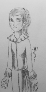
But, Jumble do not be so hard on yourself, I can clearly see what you meant to draw. There are some "artworks" in a museum that you wonder what on earth they are supposed to be.
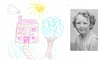
I must admit, I've never understood why a vase of flowers by Van Gogh was worth so much money My trees always looked like trees to me
This was suggested by Az'ryel BUT I'm posting it with a bit of a tweak, as we like to keep the challenges as inclusive as possible and not restrict people to a particular medium or subject matter. So your challenge this week is: EITHER draw something (ie, non-digital art), OR if you aren't up for that, incorporate something hand-drawn into your digital artwork - whether that be something you have drawn or someone else has, a texture or image or brush, or even something in there that you have drawn freehand with your mouse Basically whatever you like as long as something in it was drawn by hand somewhere along the line!
This week is a Tutorial Week. For the first week every month, we don’t issue a challenge, but instead want to encourage thread participants to share their expertise and try something new, using tutorials.
This is how it works:
1. Share a tutorial: Write a tutorial for a piece of art you have made recently, or post a piece of art you have made with the link to the tutorial you followed when you made it.
2. Follow a tutorial: Use one (or more) of the tutorials that other thread members have shared during the week to make a piece of art of your own.
The idea is that we should both teach something and learn something throughout the week
It’s not obligatory to do both, if you’re limited for time, but we’d like to encourage you to please both share and follow at least one tutorial if at all possible.
At the end of the week we will post all the tutorials along with any art made following each tutorial, so that we can see all the different interpretations all together.
Please PM your entries, including a link to the tut, to Sarai by 5pm (UK time) on Friday. Please remember to put your name on your artwork - thanks
I shall have a tut up for everyone soon!..... soon as I figure out what Im doing at the moment with this art project as it is
All those entries are amazingly better then anything I'd ever do, thougth I dont think Conversion counted so I didnt link it until now http://fav.me/dbss7am
Basically I have a FX-Foundry setting for GIMP, it wasny easy to track down so I cant readily supply the link, but inside it there is a brush type to make a digital picture look as if hand drawn on the fly. I just had to do a few miunor tweaks to the handdrawn look to properly make it smoothed out instead of comic book looking until I was happy with the result
Anyhow yeah Ima have a tut up for everyone to enjoy and make something with as soon as I figure it out myself
This is the Assassin's Way part 17 complete "Elegant beauty is Nature. but only for the gentle and soft Flower" ~Hu Ge
"The one thing every new hairstylist must learn is how to do hair in a combat zone!" Bob; owner of Bob & Weave's Combat Salon in Red Dust Club, an original story currently in progress
I must admit, I've never understood why a vase of flowers by Van Gogh was worth so much money My trees always looked like trees to me
Easy. if you look at his paint strokes they were done in such a way that the flowers, fields, night sky and whatever he painted seemed to jump out of the canvas. He had such a characteristic way of painting his subjects that stood out from the norm. Madness or talent, he was one of a kind.
However , I was recently at an abstract expressionism exhibit that made me really confused. So I know so well what you mean.
Nothing wrong with your trees. they seem like trees to me as well.
trying to find something for this week's challenge.
Josi, that's really pretty. Please, please post a tut and I'll try it. I don't really have the time or energy to attempt anything complicated, but a 10-step tut? Sure!
1. Open a new canvas and place your main picture on it (the largest one) so your characters are centred. Blend in any hard edges or find a way to fill any of the canvas that is left so that you don't have any odd hard lines showing through later. For this particular picture I extended it to the edge on one side using the clone stamp tool - but how you do this (or how neatly!) doesn't really matter as it's mostly going to be covered up.
2. Add your smaller pictures and blend them in using layer masks. You may also need to adjust their colouring a bit to match the main picture - using image > adjustments > selective color or color balance. The more you can make the colouring of your pictures match, the better the final result will be when you come to colour the whole thing
3. Add this texture, resized to fill the canvas and with the dark circle in the centre, set to screen at 100%. Again you may need to extend it to fill the canvas - in this case I had a strip missing down the right hand side so I duplicated the texture, flipped it horizontally, and moved the flipped one over to match the edge of the main one. Add a layer mask and erase any bits of the texture in the middle that cover your pictures too much.
4. Add this stock picture, resized to fill the canvas. It will be very fuzzy because it's small but that's OK, you don't actually want the picture so much as the colouring! Use the gaussian blur on a very large setting (40-50px) on it and set to hard light at 50%.
5. Next add a curves adjustment layer to brighten:
- Point 1: input 185, output 202
- Point 2: input 83, output 98
But as always just drag the curve about until you find the settings that work for your pictures
6. Next a selective color layer:
- Yellows: C 0, M 0, Y -33, B 0
- Blacks: C 0, M 0, Y 0, B +10
For this one I was trying to take out some of the yellowy tones from the smaller pictures. Upping the blacks is also a great way to bring out contrast and deepen shadows.
7. Next a vibrance layer:
- Vibrance +63
- Saturation - 32
If you don't have vibrance in your photoshop (or are using another program) mainly this layer is a partial desaturation. You could achieve the same effect by adding a solid colour layer of grey, set to color and lowering the opacity.
8. Next another selective color layer:
- Blacks: C 0, M 0, Y 0, B +27
(More deepening shadows/contrast)
9. Now the text. Fonts are Callie Hand and Californian FB (was pre-installed) and the colours are picked from the picture using the eyedropper.
10. Make a stamp of the whole thing and sharpen using filter > paint daubs.
11. Finally, add a new layer, fill with #ebebeb and set to color burn at 100%. Which is often a lovely finishing tip to make your artwork really pop
OK so maybe that was a little more complicated than I thought... Looking forward to seeing what you make of it!


 I’ll write one up later for you.
") My trees always looked like trees to me
My trees always looked like trees to me  Love it, Jumble! Very cute
Comment