
-
I makes typos all the time, and somehow never seem to catch them until it's too late. Arrgh!Originally posted by Jumble View Postsigpic
Comment
-
The problem is that we read what we meant to write and not what is actually written. I am far better at catching typos made by others.Originally posted by Nolamom View Postsigpic
Beautiful signature and avatar by Yamiinsane. You're a mind reader!
Aristides de Sousa MendesComment
-
I believe you're right. Mine are usually when I'm creating a worksheet for my classes, I get all the photocopying done, and then BAM! I see the typo. I won't waste all the paper that I just used with the photocopying, so I just tell my students that I made a typo.sigpic
Comment
-
That has happened to me as well, back in the days I taught HS. It's a shame to kill all those trees for nothing.Originally posted by Nolamom View Postsigpic
Beautiful signature and avatar by Yamiinsane. You're a mind reader!
Aristides de Sousa MendesComment
-
Comment
-
Yep - that's how it is! For some reason it's much easier for me to proofread on paperOriginally posted by Jumble View Post")
Comment
-
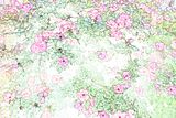
I made a texture from a picture of a rose bush - I think there are a couple of folks around here who could really make something with this. I'd love to see it!
 sigpic
Comment
-
^absolutely stunning.
BTW, Nola I made this with your butterfly stock

The objective was to blend three pics.sigpic
Beautiful signature and avatar by Yamiinsane. You're a mind reader!
Aristides de Sousa MendesComment
-
I like that JW - has a real sense of depthsigpic
Comment
-
I'm not too happy with the blending ( what else is new?Originally posted by Nolamom View Post) but that part I think I got it right. When I finished blending the three I realised that the structure in the background couldn't be as sharp as the butterflies on the foreground so I added a bit of blur so it looked " more natural" . If I knew how to work with depth of field perhaps I could have done it better. Oh, well. But the butterflies were so stunningly beautiful.  sigpic
Beautiful signature and avatar by Yamiinsane. You're a mind reader!
Aristides de Sousa MendesComment
-
Banner by Major Ryan
Challenge 111
7in7 icons
Nolamom
FanGirl
JadedWraith
Jumble
Josiane
 sigpic
Artwork for All | Sig & avi by JadedWraithComment
-
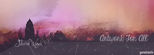
Banner by yamiinsane
Tutorial Week 33
This week is a Tutorial Week. For the first week every month, we don’t issue a challenge, but instead want to encourage thread participants to share their expertise and try something new, using tutorials.
This is how it works:
Spoiler:
The idea is that we should both teach something and learn something throughout the week
It’s not obligatory to do both, if you’re limited for time, but we’d like to encourage you to please both share and follow at least one tutorial if at all possible.
At the end of the week we will post all the tutorials along with any art made following each tutorial, so that we can see all the different interpretations together.
Please PM your entries, including a link to the tut you used, to Sarai by 5pm (GMT) next Fridaysigpic
Artwork for All | Sig & avi by JadedWraithComment
-
And here's a tut to get tut week underway
Tutorial for this wallpaper:

Spoiler:
There's been some really lovely art recently (some of the new challenge banners are particularly gorgeous) so it would be lovely to see some tutorials come out of them this week. Go on, give it a go sigpic
Artwork for All | Sig & avi by JadedWraithComment
-
Oooh, thanks for that Josi - I really like that wp I'll give it a go when I've finished being all artsy with my kitchen walls
Comment


Comment