
Sorry for the double post:
I was asking about the colours on this sig....
...and I was given the suggestion I should go darker with the "brown":

So, what's the veredict?
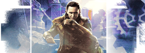
I was asking about the colours on this sig....

...and I was given the suggestion I should go darker with the "brown":

So, what's the veredict?


 - but I can in the image Nola posted

Comment