Originally posted by RodneyIsGodney
View Post


 Do you have a tut for his hun?
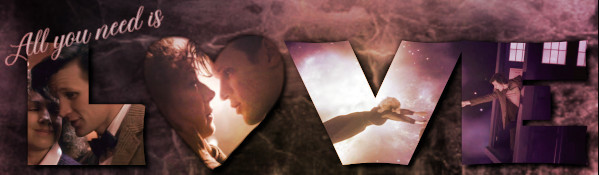 I don't remember exactly what I did but I'll try to find all the stocks/textures and come up with a tut.
 Virtual Green!!!

 To answer your question: I feel that the hair is too rigid, too sharp compared to the rest of the manip.
")


 That's probably just because I didn't know where settings were but not I'm addicted/dependent on PS lol


Comment