Announcement

Collapse
No announcement yet.

Artwork for All - challenges, graphics, tutorials

Collapse
X
 
  • Filter
  • Time
  • Show
Clear All
new posts

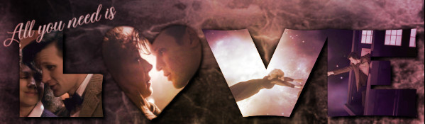
    Tut (in GIMP) for Doctor and River art.


    Spoiler:
    Textures and pics I used:


    First layer will be your "Background" layer. I left mine white.

    Don't Merge or anchor any layers

    Second layer is the pocket watch. Before I added it to the layer I scaled it down to 450x450. Use the Circular Select tool to fit the outer shape of the watch. Copy and paste into 2nd layer window. Go to "Colors" > Hues, Saturation.... and lower Satuaration to -40. Use the circular select tool again, but use it to do the inner circle of the watch... including shadow areas. Use your Eraser tool and lower the opacity to about 45-50%. Go over the whole inner circle... it shouldn't erase anything else outside of the selected area.

    Third layer: Use your desired pic and adjust to size you want... leaving a bit outside of the watch area. Go to Layer > Mask> Add Layer Mask or Right click your mouse on your layer window and click on Add Layer Mask. Use your Blending tool. (Make sure the two color window are White and Black... white being on the left). Click and drag to remove area you don't want. ("Ctrl z" if you make a mistake and need to undo.) Right click layer window again to Apply Mask. Repeat this process all the way around. For tweeking I used the the eraser tool and or the smudge tool. Mostly on the outside of the watch. Adjust coloring to your desire.

    Layers 4 and 5: Repeat masking steps as in layer 3.

    Layer 6: Add Gears pic. Set mode to Soft Light and lower the opacity to 48%. Move pic to where you want and use smudge tool to smooth out unwanted lines. You can also lower the rate if you want lines to remain, but don't want it as strong of a smudge.

    Brush Effect: I used SkullyCloudly-5. Don't remember if these are the brushes. Clouds . Check box next to " Use color from gradient" Top color #fffff and bottom color #edc79f. Scale at .20 and lower opacity to 45%. Apply brush to desire areas

    Go back to Layer 6 and user Smudge tool again to smudge out areas by clouds. I lowered the Rate to 23.0

    Texts: I used Requiem for "First Night Last Night" text. Set to size 22 and Adjust Line Space to -6. For Doctor and River I used Mathilde size 20 and Adjust Letter Spacing 2.0

    Image > Flatten Image to finalize.


    I hope I got it all.

    Comment


      Thanks Sci

      Comment


        Originally posted by Jumble View Post
        Thanks Sci
        You're welcome

        Comment


          Originally posted by Nikki Alexander View Post
          Thanks for the link.

          So I've made two versions of the same banner (I've only posted one of them) using THIS tutorial, although I skipped the last couple of steps in adding the textures because they're for icons and I've made a banner, so I added different textures.

          I should mention that it was a PSP (Paint Shop Pro) tutorial. I'm not sure whether it's transferable.
          I think some features are similar, especially the colour modes in PS and Gimp, if I'm not wrong.
          Fics | Art | Tumblr

          Comment


            I was experimenting with colouring earlier; more specifically, how to turn a normal photo into one that's got a washed-out, more vintage feel and thought I'd share it if anyone likes these similar effects. The best part is, these steps could be saved as an action.


            Spoiler:

            1. Add a new Gradient adjustment layer. Set first stop right at the utmost left to #5a2f17 and pure white at the end stop (utmost right). Set to Color, Opacity 65%.

            2. New layer, fill with #30147f. Set to Exclusion, opacity 30%.

            3. New layer, fill with #fdff25. Set to Hue, opacity 51%.

            4. Add a new Gradient adjustment layer. This time, there'll be 5 stops, positioned evenly on the spectrum. Stop 1: #350133, Stop 2: #4907a2, Stop 3: #84a2bc, Stop 4: #cfbda5, Stop 5: #ae9157. Set layer to Color, opacity 20%.

            5. New adjustment layer > selective color. Neutrals: -17, -4, 9, -3.
            Normal, opacity 100%.

            And you're done!
            Fics | Art | Tumblr

            Comment


              *bookmarking*

              Great tut, Ikorni!

              Comment


                Originally posted by ladygris View Post
                *bookmarking*

                Great tut, Ikorni!
                Thanks! I'm still experimenting, so there might be more colourings to come!
                Fics | Art | Tumblr

                Comment


                  My last colouring experiment for the day:


                  Spoiler:

                  1. new adjustment layer > gradient map. 2 stops, 1 at each end. Stop 1: #421104, Stop 2: #8c4703

                  2. new layer > gradient (Also possible with an adjustment layer). 5 stops this time, evenly spaced out. Stop 1: #fff799, Stop 2: #df7d1a, Stop 3: #857c6e, Stop 4: #eddec5, Stop 5: #ffffff

                  3. new layer > fill > #08043b. Set to Overlay, 80% opacity.

                  4. new layer > fill > #f5c799. Set to Hue, 60% opacity.

                  5. new layer > fill > #c1c1c1. Set to Multiply, 100%.

                  6. new layer > fill > #ff0000. Set to Hue, 30%.

                  Fics | Art | Tumblr

                  Comment


                    Originally posted by Ikorni View Post
                    I was experimenting with colouring earlier; more specifically, how to turn a normal photo into one that's got a washed-out, more vintage feel and thought I'd share it if anyone likes these similar effects. The best part is, these steps could be saved as an action.

                    http://i1241.photobucket.com/albums/...psbf9b4c2c.jpg

                    Spoiler:

                    1. Add a new Gradient adjustment layer. Set first stop right at the utmost left to #5a2f17 and pure white at the end stop (utmost right). Set to Color, Opacity 65%.

                    2. New layer, fill with #30147f. Set to Exclusion, opacity 30%.

                    3. New layer, fill with #fdff25. Set to Hue, opacity 51%.

                    4. Add a new Gradient adjustment layer. This time, there'll be 5 stops, positioned evenly on the spectrum. Stop 1: #350133, Stop 2: #4907a2, Stop 3: #84a2bc, Stop 4: #cfbda5, Stop 5: #ae9157. Set layer to Color, opacity 20%.

                    5. New adjustment layer > selective color. Neutrals: -17, -4, 9, -3.
                    Normal, opacity 100%.

                    And you're done!
                    Originally posted by Ikorni View Post
                    My last colouring experiment for the day:

                    http://i1241.photobucket.com/albums/...ps1d188807.jpg

                    Spoiler:

                    1. new adjustment layer > gradient map. 2 stops, 1 at each end. Stop 1: #421104, Stop 2: #8c4703

                    2. new layer > gradient (Also possible with an adjustment layer). 5 stops this time, evenly spaced out. Stop 1: #fff799, Stop 2: #df7d1a, Stop 3: #857c6e, Stop 4: #eddec5, Stop 5: #ffffff

                    3. new layer > fill > #08043b. Set to Overlay, 80% opacity.

                    4. new layer > fill > #f5c799. Set to Hue, 60% opacity.

                    5. new layer > fill > #c1c1c1. Set to Multiply, 100%.

                    6. new layer > fill > #ff0000. Set to Hue, 30%.

                    yay! I'm bookmarking these too with hopes of trying them later.

                    I'd love to green you for either of these or your Sam & Jack artwork which was just gorgeous. Virtual green.
                    sigpic

                    Comment


                      Thanks Estrela!
                      Fics | Art | Tumblr

                      Comment


                        (banner by Nolamom)

                        TUTORIAL WEEK 18

                        This tutorial by Ghislaine (Shadowplay)

                        Yami


                        From this colourisation tut

                        Josiane


                        Tut No. 1

                        Hyndara


                        Tut No. 2

                        Hyndara


                        Tut No. 3

                        Hyndara


                        This tut on LJ

                        Ikorni


                        Ladygris' tut.

                        Ikorni


                        Yamiinsane's tut

                        Ikorni


                        Jumble


                        this tut on Shadowplay

                        Ladygris


                        the second of these tuts on LJ

                        Ladygris


                        And from her own tut

                        Scifan


                        Comment


                          (banner by Maneth)

                          CHALLENGE WEEK 62

                          Suggested by Ikorni

                          Make a piece of artwork with Vintage colouring – Ikorni made
                          a tut for this here, but you can use any means you wish to create the Vintage effect

                          Size: Any
                          Pics: Any, but must be made Vintage style
                          Text: Any


                          SEND YOUR ENTRIES TO SARAI

                          Please remember to put your name in the filename!

                          Comment


                            Just made this icon with this tutorial. There's three actually on this page, but I used the last one.

                            sigpic
                            McKay: A Bow and arrow, what is this, Lord of the Rings.
                            Tony: Why do you think I call him Legolas.
                            ff.net - a03 || Tumblr

                            Comment


                              Well done, Nikki Alexander!
                              Mh, we'll see if I will come up with something for the new challenge. Right now ... it's not my day today *shrugs*
                              Anyway, great takes on the different Tuts! Uhm, Jumble, didn't I send you the sig I made after Yamii's Tut?

                              Original eBook:Der Spuk im Rosenhaus
                              Sig & Avi by Josi
                              sigpic
                              LJ, FanFic-Blog(the longest lasting German SG-fanfic series), Profile at ff.net, Profile at FF.de,Profile at deviantART (Sorry, fanfics mostly in German)
                              I'm on Twitter and on Facebook Tumblr and AO3

                              Comment


                                Originally posted by Hyndara71 View Post
                                Well done, Nikki Alexander!
                                Mh, we'll see if I will come up with something for the new challenge. Right now ... it's not my day today *shrugs*
                                Anyway, great takes on the different Tuts! Uhm, Jumble, didn't I send you the sig I made after Yamii's Tut?
                                Nope, just the three I posted

                                Comment

                                Working...
                                X