
-
-
Comment
-
A little housekeeping post
Jumble, Sarai and I were discussing a few things about the thread (over a bottle or few of wine ) this weekend, and have a few quick reminders and requests to post
1. In order to help us with the task of compiling the challenge posts, could we please request that from now on, all challenge artwork must be PMed to us by 5pm on Friday (UK time) each week. Having a formal deadline like this will mean that we are able to better plan our time to get the posts made around whatever else we may be up to on a Friday evening, and will also mean that we can put the post together without worrying about last minute entries coming in just as we've done all the compiling. If your PMed entries arrive after this cut-off time, we will not include them in the post.
2. This new deadline notwithstanding, it really is helpful if you can PM us your entries as soon as you have made them. The more stuff we can get uploaded to the thread PB account and the more of the post we can get ready in advance, the less onerous it becomes on Friday. Some of you are really good at doing this already, but a lot of people do leave it right to the last minute. We don't mind getting lots of PMs throughout the week and would much prefer that to receiving everything on a Friday. Also, if you get in the habit of PMing as soon as you've made something then you're less likely to forget completely!
3. If you have an idea for a challenge, then please PM it to one of us as well as mentioning it on the thread. We've seen various ideas mentioned in posts and we're worried we'll miss them in amongst all the art. Ideas for challenges are always welcome, and we want to make sure we receive them!
Thanks everyone! You may now return to your regularly scheduled posting of pretties sigpic
Artwork for All | Sig & avi by JadedWraithComment
-
Lovely work, everyone!
Sy, love what you did with that tut!
Bay, absolutely love your new Kavan sig!
sigpic
To Hope AgainComment
-
sigpicComment
-
You're welcome, Sy. Would have greened you, but fridge is locked. *virtual green*
sigpic
To Hope AgainComment
-
-
Something I've been working on desperately lately - light and shadows. Whenever there is a light source, there has to be a shadow. Yes, I screw this up all the time - putting together pics with light coming from opposite directions, all willy-nilly, and then wondering why they don't look good as a final product. I had someone point this out to me and it's really made me think about choices of what to put together. Anywho...very brief on shadows

simple way to make great shadows - duplicate the layer, desauturate (if that helps you - it does me) put it behind the layer you want to shadow then put a transparent layer between. On the transparent layer, using a soft brush, paint the copy of the (desaturated) image below. You can delete the desaturated copy layer now. Apply a light blur filter to desired softness (crisper for strong light, softer for weaker light) then lower the opacity of the layer to the desired level. I usually go with about 60-65% Better shadows are usually slightly offset - use transform>skew to distort your shadow.sigpic
Comment
-
-
You're welcome, Bay.
Nola, love your Jack sig! Very simple, but very effective.
sigpic
To Hope AgainComment
-
Very cool, Nola. Definitely something to keep in mind too for future art.
Will do, Josiane
sigpic~*~ My Art and Written Creations ~*~Comment
-
Thank you - I wanted to just have light and shadows. Period.sigpic
Comment
-
Nice Nola and thanks for the info on shadows
sigpicComment
-
Originally posted by syfyfan View Post
It's the new head for the updated character model for this animation:

The old model is the same as the first human model I ever made... so not very good since I didn't really know what I was doing back then. I'll have to redo the animation once I make the new body.. but it's not that hard to do really Once I built the female head mesh all I had to do was put the male head template into the background image and move the polys to match the shape Nothing was added or taken away..
Comment
-
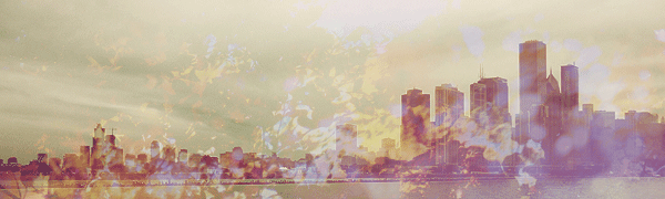
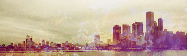
Tutorial for this banner:
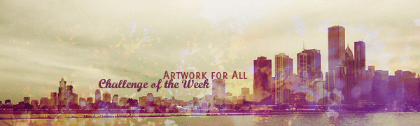
This is how you turn a normal photo (the base is one I took myself) into something more artistic using colouring. I'm including pics at each step here, as sometimes that's helpful to see what you're aiming for at the various points along the way. It uses selective colouring, so won't translate directly from photoshop into other programs, but I've tried to describe what I was aiming for with that layer to help you if you do try
Spoiler:sigpic
Artwork for All | Sig & avi by JadedWraithComment


")

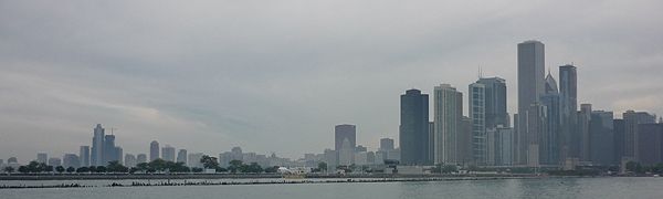
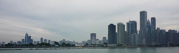
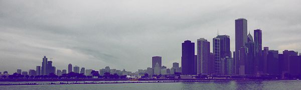
 But I wanted to dial back some of the purply-blueish tones from the previous layer and reintroduce some reddish-yellowy tones.
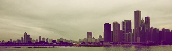

Comment