Announcement

Collapse
No announcement yet.

Artwork for All - challenges, graphics, tutorials

Collapse
X
 
  • Filter
  • Time
  • Show
Clear All
new posts

    Originally posted by ladygris View Post
    Lovely challenge entries, everyone!


    Thanks, Cag. We were celebrating Joe and Pauly's birthday yesterday.

    While I mention that, thanks to those of you who came over to the Carson Beckett Challenges and Fun thread to share your artwork or just chat for a few moments! It made the day a lot of fun.
    Ah bummocks, I missed it. I did want to stop by and say hi. Any excuse for a party, that's me.

    Blacky, I am loving the Sherlock art. Oh that's one heck of a programme; think I might be a fan.

    Sy, great tut and nice job with it. Since I'm pretty rubbish at writing tuts (they usually run along the lines of "if you twiddle with the thingy and adjust the wosit setting a bit..." ) I might use yours to make something with instead.

    Nice one Nola. That's a look that suits Martin.
    sigpic

    Comment


      Originally posted by josiane View Post
      Can't see any from you in my PMs Maybe the gremlins ate it I should be able to edit a few in if you send them to me now though

      Thanks for the tuts, sy and Nola! And love the Martinart
      I've put them in the PB folder

      Comment


        Originally posted by Jumble View Post
        I've put them in the PB folder
        Got them! All added in
        sigpic
        Artwork for All | Sig & avi by JadedWraith

        Comment


          Originally posted by josiane View Post
          Got them! All added in
          Thank you

          Comment


            A while ago, Ladygris asked for a tutorial on this wallpaper:


            Spoiler:
            1. Create a new document, 1400 x 900 pixels. I always create a file with 300 dpi for wallpapers – then save as a TIFF file. You can still edit all the layers and it’s one of the best formats for compression.

            2. Fill with #d5d5d5

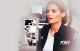
            3. Prep your main image in a separate window - this should be decent quality! This one is from the Castle screencaps website but is one of the pre-released episode stills so the quality is much higher and good for WPs.

            4. Sharpen the image Filter > Sharpen > Sharpen

            5. Then choose your Blur Tool (R) and go round over anywhere her skin is showing. This is something I do for most pics I use – it softens off the features and removes any *ahem* ‘blemishes’

            6. Now add a curves layer – click on the diagonal line and drag it to create a point, making sure the preview box is checked so you can play around with what works best for whatever image you use. For this one, there are two points on the graph. The top one is Output > 221 and Input > 154 and the bottom one is Output > 97 and Input 77.

            7. Selective Colouring Layer

            Reds
            C: -100
            M: 0
            Y: -10
            B: 0
            Greens
            C: 100
            M: 0
            Y: 0
            B: 0
            Whites
            C: 36
            M: 0
            Y: 18
            B: 0
            Neutrals
            C: 10
            M: 0
            Y: 0
            B: 0
            Blacks
            C: -6
            M: 5
            Y: 0
            B: 0

            8. Add another Selective Colouring Layer

            Reds
            C: -8
            M: 0
            Y: 15
            B: 10
            Neutrals
            C: -8
            M: 0
            Y: 0
            B: 0
            Blacks
            C: -2
            M: 0
            Y: 0
            B: 0

            9. Make a stamp of the layers (PC – Alt+Ctrl+Shift+E)

            10. Add the pic into your grey background you created earlier and add a layer mask to the image then selecting a large brush (huge, like around 800 px ) start to erase the parts around Kate so the focus is on her.

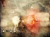
            11. Add in this texture and position where you want it.


            12. Using these brushes, select the eraser tool and randomly erase around the edges of the layer to make it look grungy.

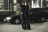
            13. Now open up the four images you want to use. Make sure they are all the same size – these were all from the Castle Screencaps site so were already but you may need to crop and resize to make all yours the same. I’ve added a Brightnass/Contrast Layer and a Curves layer to each.

            14. Castle/Beckett on ground. Curves top point Output > 243 and Input > 159 and bottom point Output > 104 and Input > 63. Brightness +135. Leave Contrast at 0.


            15. Beckett looking over shoulder to camera. Curves top point Output > 244 and Input >143 and bottom point Output > 153 and Input > 46. Brightness +35. Leave Contrast at 0.


            16. Castle looking at camera. Curves top point Output > 221 and Input > 158 and bottom point Output > 116 and Input > 54. Brightness +36. Leave Contrast at 0.


            17. The kiss. Curves top point Output > 206 and Input > 130 and bottom point Output > 91 and Input > 54. Brightness +50 and Contrast +35.


            18. Merge layers or make a stamp of each then put into the wallpaper and position in the ripped paper texture. If you select all four layers you can use the align tools to get them all in line and the same distance from each other.

            19. Nearly done! Add a final Selective Colouring layer.

            Reds
            C: -100
            M: 0
            Y: 9
            B: 0
            Blues
            C: 49
            M: 0
            Y: -42
            B: 26
            Neutrals
            C: -24
            M: 0
            Y: 0
            B: 0
            Blacks
            C: 11
            M: 0
            Y: 0
            B: 0

            20. Finally add your text. The font is Champagne & Limousines. I find it’s easier to make four text layers then align them rather than one big layer. Highlight the text and make it white, then pick one word from each line to make pink #ffbcbc.


            And you’re done! Sorry it's taken me so long

            Comment


              Nola, The Director is definitelly cool!
              sci, love The Hobbit art! That role is just made for Martin!
              Very cool tuts, sy, Nola and Sarai!

              Originally posted by Graceful Spirit View Post

              Beautiful arties Nola, Sy, MR, Rocket, Cags, Jumble, Yami, Kitten, Val, lg, Bailey, Josi, Sci, Mane, Sha & DeliRicia
              Originally posted by Cagranosalis View Post
              Blacky, I am loving the Sherlock art. Oh that's one heck of a programme; think I might be a fan.
              Thanks you both!

              I've mad e a Sherlock sig
              Last edited by Blacky Kitten; 07 January 2012, 02:54 PM.
              sigpic

              Comment


                Ooh, yay! Thanks, Sarai!

                Comment


                  Nice Sherlock sig, Kitten! I've been Sherlocking too...


                  Thanks for the tut Sarai! Love that wallpaper
                  sigpic
                  Artwork for All | Sig & avi by JadedWraith

                  Comment


                    Hehe, there are two of us now
                    Thanks and cute set
                    sigpic

                    Comment


                      Originally posted by ladygris View Post
                      Ooh, yay! Thanks, Sarai!
                      You're welcome, sorry it's taken me so long to upload it for you

                      Gorgeous Sherlock arties Josi and Blacky!! Just been hunting for some screencaps

                      Comment


                        Originally posted by Sarai View Post
                        You're welcome, sorry it's taken me so long to upload it for you

                        Gorgeous Sherlock arties Josi and Blacky!! Just been hunting for some screencaps
                        Thanks, hun!
                        You can find los of Sherlock screencaps here
                        sigpic

                        Comment


                          Originally posted by Blacky Kitten View Post
                          Thanks, hun!
                          You can find los of Sherlock screencaps here
                          Thanks hun these are the best I've seen so far

                          Comment


                            Originally posted by Sarai View Post
                            Thanks hun these are the best I've seen so far
                            I don't think you'll find any better
                            sigpic

                            Comment


                              Hey!

                              Okay, here's two wallies I made this morning using Sarai's tut. They're the same basic thing, but the lay-out is different.


                              Definitely going to use that tut again!

                              Comment


                                And, while I'm here, figured I'd go ahead and post this tut since a friend asked for it.

                                So, to make this:


                                Spoiler:
                                You will need:
                                Two pics of Carson OR whichever character you choose.

                                **NOTE: The dark grungy texture is sized 1366x768 already.

                                You'll also need these: Corner Photoshop Brushes

                                Open up your canvas, 1366x768. Add first dark, grungy texture.

                                Add the second texture. Scale up to fill the canvas. Set to Overlay, opacity 100%.

                                Add third texture. Set to Overlay, opacity 100%. Use layer masks to blend the edges and bottom, and then scale up so that the pic is as tall as the canvas. Move to the left side of your canvas.

                                Add fourth texture over the reddish part of the background. Set to Overlay, opacity 100%. Do not scale up or down unless you want to, only make certain to reverse the picture. Then, using a large fuzzy brush, erase the edges so it blends.

                                Open your two pics of your character. Crop them so that they're exactly the same size.

                                New Layer—Transparency. Using one of the corner brushes, set your brush size so that it frames the pictures. With color #f2e6b3, carefully apply one corner to the edge of your first picture. This will take some experimentation to get the size of the brush right. If it's not right, just Ctrl-Z to erase the brush and try again.

                                Once the size of the brush is set, duplicate the layer with the corner, reverse the direction of the picture, and then flip the picture by using the same tool while holding down the Ctrl key. Then, position that new layer over the corner diagonal to the first brush. Merge your two layers with the brushes together.

                                Using the eraser and a small fuzzy brush, erase the edges of the picture that overlap the corners. Then, put a stroke around the picture using the same color as the brushes. Finally, merge your layers so that the corners and the picture are all one layer.

                                Repeat all of that with second picture.

                                Once those layers are complete, use the Rotate tool to angle your pictures, fiddling with it and with layer order until you're happy. I made sure to set it so that all the decorative corners and most of the borders were visible. Merge those two pictures together so they can be moved as one.

                                Now for your text. This gets a bit technical but is really not that complicated.

                                I used Many Weatz.

                                Type in your text, using the same color as the corner brushes. Duplicate the layer. Change the color on that layer to #222222, a dark gray. Do not move either layer around. Select the first layer (the light colored one).

                                Filters-->Blur-->Gaussian Blur. You will see two numbers under “Blur Radius.” Make certain those two numbers have the little chain between them, and set both of them to 12. When you do this, it will create a nice light glow around your dark text.

                                Duplicate your dark text again and change the color in this new text layer back to the light color you used before. Then, moving only the top light colored layer, move the layer down about one pixel. This will create a slight shadowed effect at the top of the text. Merge ALL text layers together.

                                Finally, create a new fill layer with color #222222. Set to Multiply, opacity around 54%. Move this layer below the two pictures and the text. It'll create a nice shadow. Using your largest fuzzy brush, erase all but the area below the text and the slightest shadows under the pictures. This allows the brightness (such as it is) of the background to show while adding some depth.


                                And that's it. Sounds complicated, but it's all very simple. If you have any questions, just ask and I'll try to answer them.

                                Comment

                                Working...
                                X