Welcome to GateWorld Forum! If this is your first visit, we hope you'll sign up and join our Stargate community. If you have questions, start with the FAQ. We've been going strong since 2004, are we are glad you are here.
Announcement
Collapse
No announcement yet.
Graphic Arts Tutorials, Textures, Resources Thread
It's selective coloring. that's why I show you the texture instead of the coloring, so everyone can use it (hullo PSP user ).
But you can also use another coloring. Depends on what you like to have. ;D
Okay. Create a new document 500x200 (or whatever you prefer). Open your pic. Make sure there's a bright background.
Like promo pics with a white or grey background.
Or make sure there are some bright parts.
You can cut it out or you can use the smudge tool.
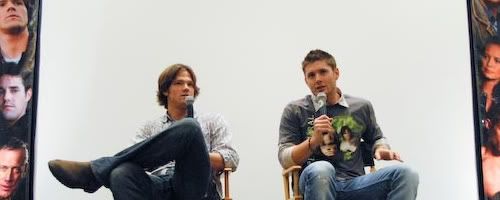
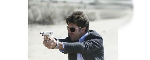
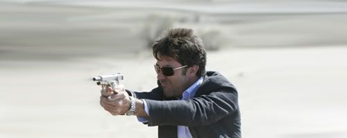
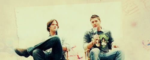
BASE
THAT'S the pic I used.
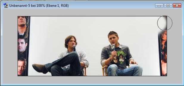
As you can see, there's that white square behind them and colorful parts left and right.
Now I used the smudge tool to drag that white background over the whole canvas.
You could also erase the parts and fill the base layer with the color of the white/grey part behind them.
But sometimes smudging is easier than erasing.
Using the smudge tool to drag the bright part over the canvas (try to make it as bright as possible.)
Looks like that now.
My base looks like that now.
COLORING
Spoiler:
There's selective coloring. I'm sorry. It makes the dark and blue colors more colorful.
You can skip that step or try something else. I'm sorry.
Dublicate your base and set to screen.
If it's to bright play with the opacity.
New adjusmentlyer > Channelmixer
Red
+103
-10
+3
Blue
+3
+5
+89
New adjusmentlyer > Selective Coloring
Red
-80
+15
+28
+5
Yellow
-19
0
-40
+5
Cyan
+70
+20
+35
+40
White
+60
0
+10
-38
Neutrals
+10
0
0
+10
Black
black +10
Filllayer #3C0B0B soft light 30%.
Fillayer #82CDE9 multiply 20%.
New adjusmentlayer > Levels
RGB
14; 1.24; 250
Filllayer #6A6A6A soft light 100%.
Filllayer #C0C0C0 overlay 40%.
Don't merge.
Now put the texture on top and set to multiply 100%.
Looks a bit too dark. So I dublicated the first screenlayer.
I duplicated it again and put it almost on top. Underneath the texture set to soflight 50%.
TEXT
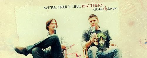
"We're truly like brothers!" in Felix Titling
and Jensen&Jared in Pea Amy*Rica Script.
Different sizes, different colors. As usual. ;D
As final step I took THAT scratch texture, set to color dodge. I erased some parts over their faces.
Merge and sharpen or whatever you like.
I used my beloved paint daubs again.
It's selective coloring. that's why I show you the texture instead of the coloring, so everyone can use it (hullo PSP user ).
But you can also use another coloring. Depends on what you like to have. ;D
Okay. Create a new document 500x200 (or whatever you prefer). Open your pic. Make sure there's a bright background.
Like promo pics with a white or grey background.
Or make sure there are some bright parts.
You can cut it out or you can use the smudge tool.
BASE
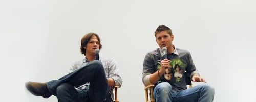
THAT'S the pic I used.
As you can see, there's that white square behind them and colorful parts left and right.
Now I used the smudge tool to drag that white background over the whole canvas.
You could also erase the parts and fill the base layer with the color of the white/grey part behind them.
But sometimes smudging is easier than erasing.
Using the smudge tool to drag the bright part over the canvas (try to make it as bright as possible.)
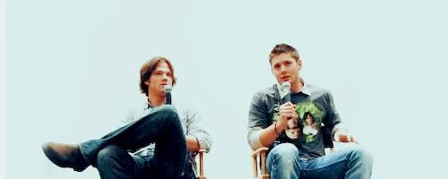
Looks like that now.
My base looks like that now.
COLORING
Spoiler:
There's selective coloring. I'm sorry. It makes the dark and blue colors more colorful.
You can skip that step or try something else. I'm sorry.
Dublicate your base and set to screen.
If it's to bright play with the opacity.
New adjusmentlyer > Channelmixer
Red
+103
-10
+3
Blue
+3
+5
+89
New adjusmentlyer > Selective Coloring
Red
-80
+15
+28
+5
Yellow
-19
0
-40
+5
Cyan
+70
+20
+35
+40
White
+60
0
+10
-38
Neutrals
+10
0
0
+10
Black
black +10
Filllayer #3C0B0B soft light 30%.
Fillayer #82CDE9 multiply 20%.
New adjusmentlayer > Levels
RGB
14; 1.24; 250
Filllayer #6A6A6A soft light 100%.
Filllayer #C0C0C0 overlay 40%.
Don't merge.
Now put the texture on top and set to multiply 100%.
Looks a bit too dark. So I dublicated the first screenlayer.
I duplicated it again and put it almost on top. Underneath the texture set to soflight 50%.
TEXT
"We're truly like brothers!" in Felix Titling
and Jensen&Jared in Pea Amy*Rica Script.
Different sizes, different colors. As usual. ;D
As final step I took THAT scratch texture, set to color dodge. I erased some parts over their faces.
Merge and sharpen or whatever you like.
I used my beloved paint daubs again.
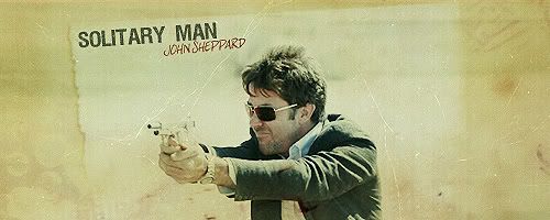
okay, i'll post my results ASAP but I needs massive amounts of help.... I'm using the tut to make a siggy for my fic... my Supernatural/Atlantis crossover... so I have Dean and John on there... but I can't think of any text... any suggestions... song lyrics anything that would fit the both of them (or if you've read the little bit of my fic i have posted, any lines or anything?)
It's selective coloring. that's why I show you the texture instead of the coloring, so everyone can use it (hullo PSP user ).
But you can also use another coloring. Depends on what you like to have. ;D
Okay. Create a new document 500x200 (or whatever you prefer). Open your pic. Make sure there's a bright background.
Like promo pics with a white or grey background.
Or make sure there are some bright parts.
You can cut it out or you can use the smudge tool.
BASE
THAT'S the pic I used.
As you can see, there's that white square behind them and colorful parts left and right.
Now I used the smudge tool to drag that white background over the whole canvas.
You could also erase the parts and fill the base layer with the color of the white/grey part behind them.
But sometimes smudging is easier than erasing.
Using the smudge tool to drag the bright part over the canvas (try to make it as bright as possible.)
Looks like that now.
My base looks like that now.
COLORING
Spoiler:
There's selective coloring. I'm sorry. It makes the dark and blue colors more colorful.
You can skip that step or try something else. I'm sorry.
Dublicate your base and set to screen.
If it's to bright play with the opacity.
New adjusmentlyer > Channelmixer
Red
+103
-10
+3
Blue
+3
+5
+89
New adjusmentlyer > Selective Coloring
Red
-80
+15
+28
+5
Yellow
-19
0
-40
+5
Cyan
+70
+20
+35
+40
White
+60
0
+10
-38
Neutrals
+10
0
0
+10
Black
black +10
Filllayer #3C0B0B soft light 30%.
Fillayer #82CDE9 multiply 20%.
New adjusmentlayer > Levels
RGB
14; 1.24; 250
Filllayer #6A6A6A soft light 100%.
Filllayer #C0C0C0 overlay 40%.
Don't merge.
Now put the texture on top and set to multiply 100%.
Looks a bit too dark. So I dublicated the first screenlayer.
I duplicated it again and put it almost on top. Underneath the texture set to soflight 50%.
TEXT
"We're truly like brothers!" in Felix Titling
and Jensen&Jared in Pea Amy*Rica Script.
Different sizes, different colors. As usual. ;D
As final step I took THAT scratch texture, set to color dodge. I erased some parts over their faces.
Merge and sharpen or whatever you like.
I used my beloved paint daubs again.
That's gorgeous, DJ ! Have no idea who he is but *t h u n k*
I've been wondering how to do this for ages, and I found the tut on the first page. It's a sig for our challenge of the week over on the S/J Art Thread:
 !
!


 stunning DJ!


 ).
).

Comment