Welcome to GateWorld Forum! If this is your first visit, we hope you'll sign up and join our Stargate community. If you have questions, start with the FAQ. We've been going strong since 2004, are we are glad you are here.
Announcement
Collapse
No announcement yet.
The secrets on how to make artwork of the Sam/Jack ship family thread
I'm trying to encourage some new S/J artists. So I thought I'd share something I learned here and there, mostly from others on this thread that helped me a lot.
How to prep a pic, especially sg-1 screen caps, for use in artwork.
I've found this especially useful for caps from the earlier seasons of sg-1 because the pictures tend to be dark and grainy. So this is how I brighten them up and smooth them out.
(All of this is done in PS Elements 10, but it should work for any PS program; I'm keeping it simple.)
Start with your cap:
As you can see, it's a little dark. There is some graininess and pixilation.
First I want to lighten it up a bit.
There are lots of ways to do this from very simple to extremely complex. This is my method. I find it easy and quick.
Make three copies of the background layer (ctrl+J).
Set the blend mode on the top two layers to screen and the third layer to soft light. Now I'll fiddle with it until I get it to the lightness I want either by adding or eliminating 'screen' layers and playing with their opacity. I like my pictures bright so in this case I added another 'screen' layer, but that was too bright; so I lowered the opacity of that layer to 50%.
When I'm happy with it I combine all the layers (ctrl+shift+E)
Now it looks like this:
You can see the difference in brightness.
Now I want to get rid of the graininess. So I'm going to use the noise reduction filter. On the menu bar go to Filter>Noise>Reduce Noise. You'll get a dialog box with a preview window. I like my pics smooth (almost painterly) so I'm going to set my filter at Strength: 10; Preserve Detail: 10%; Reduce Color Noise: 50%.
Choose the values that you think work best and click OK.
I may want to fine tune some areas by using the blur tool at 50% strength just to smooth out the pixilation around the skin a bit more.
One problem I have now is that the picture has become a little soft and blury. I want to sharpen the edges and outline their faces. Again there are lots of ways to do this. I like using the High Pass filter.
Make a copy of the current layer (ctrl+J). Make sure you have the copy on top and that layer is selected. Then on the menu bar go to Filter>Other>High Pass.
I'm just looking for a bare outline of their features so I've chosen a very low radius of 3.0 pixels and clicked OK.
Now I'm going to set the layer blend mode to Overlay and reduce the opacity to 60%. (I usually keep it somewhere in the neighborhood of 50% opacity. The higher the opacity the sharper the edges, but also the greater pixilation you'll see.) Then I combine my two layers (ctrl+E).
I think their faces look great, but I'm going to take my blur tool and just run it over their clothes and the background to smooth it over a bit. If their features need a little sharpening I can pass the sharpen tool over their eyes and mouth for a little fine tuning.
And here we have it:
I went from this . . . to this . . .
. . . in just a few easy steps.
Each cap is a bit different so it takes some adjustments, but generally when I follow these steps I get the look I like for using the picture in my artwork.
Thanks for the tips! I don't usually do the noise reduction steps as I generally cut out the figures first and then do further adjusting, but it's a nice idea for some pics. Certainly improves the images.
Thanks for the tips! I don't usually do the noise reduction steps as I generally cut out the figures first and then do further adjusting, but it's a nice idea for some pics. Certainly improves the images.
I do the noise reduction because it makes the picture look really smooth, which is a look I like. Some may think it looks too artifical. But you can tone down the noise reduction so it doesn't look quite so extreme.
I usually prep the whole pic before I cut out the portions I'm going to use because I find it makes blending the edges easier.
@hlndncr I'm printing your info and I'll play with it regarding vidding. The early seasons are big pain indeed. Not sure if I can reproduce all you do but I'll work on it. Thanks a bunch!
@hlndncr I'm printing your info and I'll play with it regarding vidding. The early seasons are big pain indeed. Not sure if I can reproduce all you do but I'll work on it. Thanks a bunch!
You're welcome. I hope it helps. There's only so much you can do with the early seasons. They just weren't filmed at a high enough resolution for the pics to come out well. But I do find that it improves the look some.
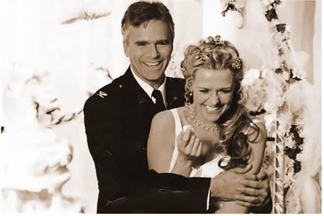
selene asked me if there was an easy way to create a Sepia effect in PS. In fact, there are several.
I thought I would share with everyone.
I started with this picture:
I find that all of these techniques work better if you desaturate the photo first (Ctrl+Shft+U).
Sepia Version 1: Layer Styles
Under the "Effects" tab of the Edit palette, click on the "Layer Styles" icon (2nd from left).
Select "Photographic Effects" from the drop down menu.
Click on the "Sepia Tone" icon (brown square).
Click "Apply"
Pull up the Hue/Saturation dialog box (Ctrl+U) to adjust the saturation and lightness until you have the effect you want (varies with each image).
Sepia Version 2: Color Variation
Click on the "Enhance" menu at the top of the screen.
Select "Adjust Color" and then "Color Variations".
Set the "Adjust Color Intensity" slider one notch to the right. (I find it easier to get the right look if I make several small adjustments instead of trying to get it all in one go.)
Midtones should already be selected.
Now "Decrease Blue" and "Increase Red" in small increments until you have a nice Sepia brown color. (You may want to play with the shadows and highlights as well.) I have also darkened the highlights slightly and increased the saturation a little.
To the right there are buttons that allow you to undo or redo the previous adjustment. You can also reset and start from the beginning if you need to. The preview pane will show you the difference between the image you started with and how it looks with the changes you've made.
When you're happy with the look Click "OK".
Sepia Version 3: Detail Smart Brush Tool - Sepia Duotone
Select the "Detail Smart Brush Tool" (F). It looks like a brush with a cog wheel over it.
Click on the thumbnail menu near the top of the screen.
Select "Photographic" from the drop down menu. Then Click on "Sepia Duotone".
Make sure the "+" brush is selected. Brush over the entire image. This will create an adjustment layer mask above the base image. (The thumbnail you see in the Layer palette should be completely white.)
Now you may want to play with the blending mode and opacity until you get the look you want. I recommend trying the "Color" mode first. In this case I chose to go with "Hard Light" at 80% opacity.
I also darkened the desaturated base image using the Hue/Saturation dialog box (Ctrl+U).
When you are satisfied with the look combine the adjustment layer with the image (Ctrl+E). (This combines the layer selected with the layer immediately below it in the Layers palette.)
Sepia Version 4: Detail Smart Brush Tool - Chocoholic
Select the "Detail Smart Brush Tool" (F). It looks like a brush with a cog wheel over it.
Click on the thumbnail menu near the top of the screen.
Select "Color" from the drop down menu. Then Click on "Chocoholic".
Make sure the "+" brush is selected. Brush over the entire image. This will create an adjustment layer mask above the base image. (The thumbnail you see in the Layer palette should be completely white.)
For this one you have to change the blending mode to "Color". You may want to play with the opacity. I left it at 100% for this image.
Combine the adjustment layer with the image layer (Ctrl+E).
As you can see, each technique gives the image a slightly different look. Which technique you use depends on the image you are using and the look you want to achieve.
Remember the best approach is to apply these sage words of wisdom from Jack: HAVE FUN!!!
You know, hlndncr, I actually was trying to sepia that exact wedding picture for something I was working on for Ship Day. *sigh* Good thing I have loads more to share!
You know, hlndncr, I actually was trying to sepia that exact wedding picture for something I was working on for Ship Day. *sigh* Good thing I have loads more to share!
You can still do it! Never too much of a good thing.
 It’s Party Time!


 /
/
 No Sam w/o a Jack and no Jack w/o a Sam.


Comment