Announcement
Collapse
No announcement yet.
The secrets on how to make artwork of the Sam/Jack ship family thread
Collapse
X
-
Usually just lurk, but that turned out so amazing hlndncr, that I had to say so. sigpic~*~ My Art and Written Creations ~*~
Comment
-
Originally posted by bailey1ak View PostUsually just lurk, but that turned out so amazing hlndncr, that I had to say so. Thanks! I was really pleased.Originally posted by Oma-1 View PostWooo, great job with the manip
 The best ones are the ones that you can't tell aren't real....I can't tell it isn't real! And I looked real hard to seen which bits of which pic you'd used
  Awesome!
*throws virtual green*
Now I need to use it in a sig so I can enjoy it popping up in my sig rotation from time to time. sigpic
My Art. My Fanfic.
Comment
-
I sent her a message, now I'm just waiting to see if she responds.Originally posted by Oma-1 View PostOh wow Val, what a find, that's excellent! I'd love to get my hands on some of those textures and brushes. You could always try asking the person who's LJ you found it on for a tut. In the meantime, I'm feeling the urge to open PS and have a go! If I get anything like it i'll let you know how.
Ooh, it purty. @.@Originally posted by Oma-1 View PostNot quite like the Bones one, but I still like it
...would you be willing to make me a tut of the awesome?
Comment
-
Tut for this as requested by Val.

Spoiler:
I played around lots with layer order, so I can't remember each step. I'll just let you know what each layer is in the finished pic. The main thing really is just learning how to use the different layer types to blend your textures into the pic anyway
Caps
1.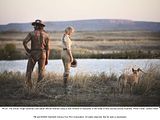 2.
2.  3.
3.  4.
4. 
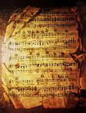
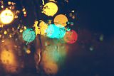
Textures
1.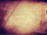 2.
2.  3.
3. 
4. 5.
5. 
Layer 1. Texture 1, resize and desaturate.
Layer 2. Cap 1, resize, desaturate, set to 20% opacity. Use a large feather brush to blend in.
Layer 3. Texture 2, set to Lighten 100%.
Layer 4. Duplicate layer 2, set to Screen 100%.
Layer 5. Cap 2, desaturate. Adjustment Layer: Levels, move the white slider to the left to around 100. Use the magic wand to delete the white. Then re-size and blur slightly. Set to Soft Light 100%.
Layer 6. Cut out a piece of the music place in top right quarter. Desaturate, set to lighten 100%. Adjustment Layer: Levels, move the grey slider in the middle to the left set to around 2.6. Erase the edges using a large feather brush. (This was actually the last layer I did after I decided I wanted to put notes behind the text )
)
Layer 7. Texture 3, set to Lighten 100%. Resize and place with the white strip on the right just showing.
Layer 8. Cap 3, cut and resize to required size. Sharpen.
Layer 9. Duplicate Layer 8, set to Screen 50%.
Layer 10. Duplicate Layer 9, set to Hard Light 100%.
Layer 11. Duplicate Layer 8 again. Flip horizontally, re-size slightly smaller, desaturate, set to Soft Light 100%, sharpen.
Layer 12. Duplicate Layer 8 once more. Resize smaller, set to Multiply 100%.
Layer 13. Duplicate Layer 12. Set to Hard Light 100%. You'll need to use the square selection tool to cut out the corner of layers 8, 9 and 10 from underneath. If you cut slightly bigger you'll get the line effect around the two edges.
Layer 14. This is just a white grunge border brush across the pic level with the bottom of layer 13. I can't remember where I got it from though, I've had it for years.
Layer 15. Texture 5, re-size, place in top left quarter, set to Lighten 100%. Use large feather brush to erase the parts you don't want.
Layer 16. Cap 4, just the eye section, resize, desaturate, set to Hard Light 100%, erase the light part on the right with large feather brush, leaving the fence texture over the top of the icons.
Text: Top Line - ES Splendid, Middle Line - Century Gothic (I think that one's a standard font), Bottom Line - Jane Austen and Aubrey. All have Outer Glow, colour 737362 set at Normal, 66%, size 4.sigpic
Comment
-
Beautiful manip there.Originally posted by hlndncr View PostBeautiful Oma!
I took this:
http://i1012.photobucket.com/albums/af243/hlndncr/th_222_outofmind_03.jpg
And this:
http://i1012.photobucket.com/albums/af243/hlndncr/th_222_outofmind_04.jpg
And made this:
http://i1012.photobucket.com/albums/...t/OoMManip.jpg


 No Sam w/o a Jack and no Jack w/o a Sam.
It's like and immutable law of the multiverse.
Comment
-
That header is scrumptious Oma, definitely going to have a go at that tonight, thanks for posting the tut!
And great manip hlndncr!!sigpic
Artwork for All
Comment
-
I didn't request it, but I'd love to have it.Originally posted by Valerie_Jackson View PostThanks Oma. Gonna go try that now.
...wait, didn't someone request a tut for this sig a while back?
http://i939.photobucket.com/albums/a.../BabyBBSig.png
Sorry I never got to it, do you still want it? (Sorry, forgot who requested it) sigpic
My Art. My Fanfic.
Comment
-
OK.
Tut requested by... I don't know. :|

Spoiler:OK, I started by opening up a new file, 425x180, then I capped and resized these pics, (1. and 2.), placed them next to each other. (no cutting anything out, just putting them where they aren't covering each other)
I then used my favorite brush to smudge everything around them, going side to side.
Then I added this texture to it, smudged (this time going up and down) then set to screen.
New layer, fill with white, set to overlay, duplicate layer. Set second layer to 56.1 opacity.
New layer, fill with black, set to overlay, duplicate this layer.
Now for the text, I used curlyJoe for Baby, and Night.. and I cannot for the life of me find the other font I used, sorry. :\
Add borders to the fonts, (set to overlay and blur for plainish text border) and voila, you're done.
There, so easy caveman could do it.
Comment
-
OK, it never would have occurred to me to smudge the texture like that. You guys come up with so many clever ideas.sigpic
My Art. My Fanfic.
Comment
-
Very nice. I wouldn't have know that last one was a manip if you didn't tell me.Originally posted by hlndncr View PostBeautiful Oma!
I took this:
http://s1012.photobucket.com/albums/...tofmind_03.jpg
And this:
http://s1012.photobucket.com/albums/...tofmind_04.jpg
And made this:
http://i1012.photobucket.com/albums/...t/OoMManip.jpg


Comment
-
Jumble - Lovely boobling! I love your last sigs.
Oma - Wow! Beautiful header! And thanks for the tut.
Hlndcnr - Oma's right. You can't tell it isn't real! (If I didn't know the episode so well, I'd fall for it. ;D) Awesome work!
First challenge entry:
I realised it's not 700x200. It's 600x180. :/ My usual sig size. Didn't think before doing it. Tried making it bigger but it doesn't come out as good. (IMHO) If you prefer to have the banners all the same size, I'll obliged and resize it. No problem.

That's what being sick does. I didn't go to my last class of the day, came home early and had time to do artwork. (But I HATE being that sick, so MEH.
  )
)
Second banner will be done this weekend probably. sigpic
Live Peace. Speak Kindness. Dwell in possibility.
My Livejournal. | My fanfictions. | My videos. | My twitter.
Beautiful avi and sig are birthday presents fom josiane!
Comment




Comment