
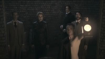
CC - oh, well...  It took me about 3 hours to make (I use PS CS3)
The basic ideas are:
- crop the screencap and paste it onto black background (I rotated it a little bit, too)
- create a layer mask using soft brushes with low opacity to make the image blend into the background (I didn't erase anything at all, it was all about masking)
- using layer mask and burn & dodge tools make the shadows more intense and emphasize the highlights
- on a new layer, use small hard and soft brushes (I make my own presets for those, setting opacity, angle & shape dynamics so that it looks more... alive) and just add black and white accents and so play with light a bit. It also gives that painting impression. I draw with a mouse, so the lines turn out to be... well, far from perfect
- in the end, add a couple of adjustment layers (I used Selective Colour option to adjust the way black and yellow tones looked like and added a Gradient Map layer)
- the very last thig to do - several font layers of different colours and opacity. I used this particular font because it's decorative enough and looks like handwriting... and well, because I just like it
- merge all layers (I've had about a dozen by this time) and that's it!
It took me about 3 hours to make (I use PS CS3)The basic ideas are:
- crop the screencap and paste it onto black background (I rotated it a little bit, too)
- create a layer mask using soft brushes with low opacity to make the image blend into the background (I didn't erase anything at all, it was all about masking)
- using layer mask and burn & dodge tools make the shadows more intense and emphasize the highlights
- on a new layer, use small hard and soft brushes (I make my own presets for those, setting opacity, angle & shape dynamics so that it looks more... alive) and just add black and white accents and so play with light a bit. It also gives that painting impression. I draw with a mouse, so the lines turn out to be... well, far from perfect
- in the end, add a couple of adjustment layers (I used Selective Colour option to adjust the way black and yellow tones looked like and added a Gradient Map layer)
- the very last thig to do - several font layers of different colours and opacity. I used this particular font because it's decorative enough and looks like handwriting... and well, because I just like it
- merge all layers (I've had about a dozen by this time) and that's it!


 Thanks for that


 No Sam w/o a Jack and no Jack w/o a Sam.
Comment