
Originally posted by Graceful Spirit
View Post


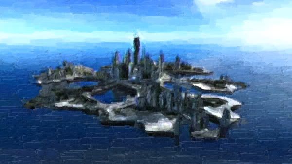
Okay, I'm back with another entry for the tutorial challenge. I used this tut by jasminaGo to make a banner for a challenge. The challenge was to make art for our favorite shippy fanfic, and at least one of them had to be Ronon/Keller. So, this actually fits two challenges.

 ) below that you can look at if you so desire.
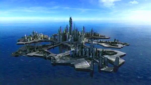
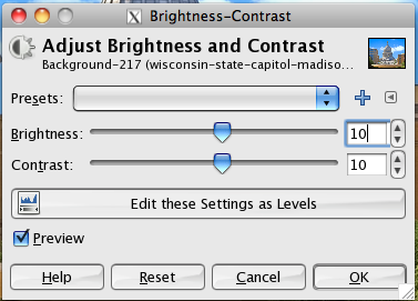
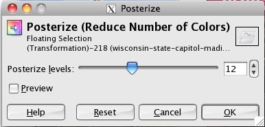

 I've found that the best tuts are video tuts, not only do they tell you what to do, the show you what to do. You can actually see what they're doing, what they're clicking and everything. I'm always YouTubing Gimp tuts, there's so many out there. PS tuts as well!


")

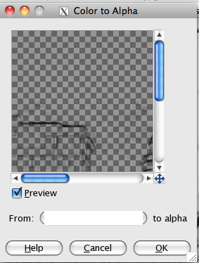
 The way around the transparent background is to match the background colour to the colour of background post. I know I have the colour code around here somewhere........*runz off to PS*.......I think its #f1f1f1
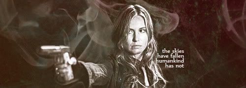


") )
)
Comment